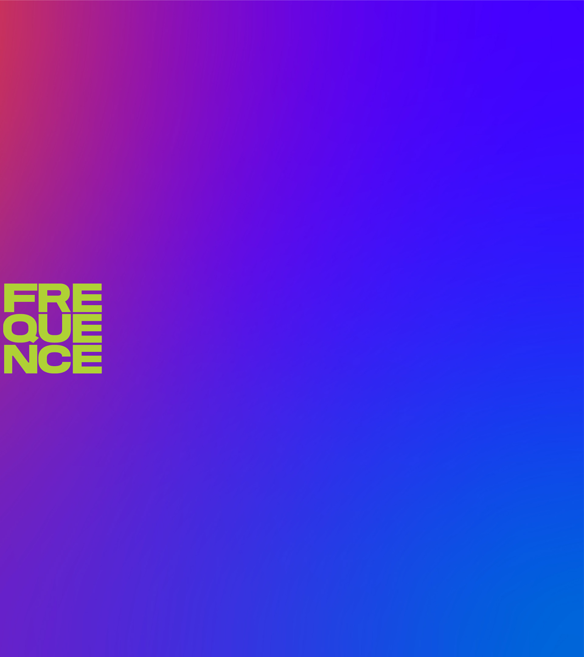
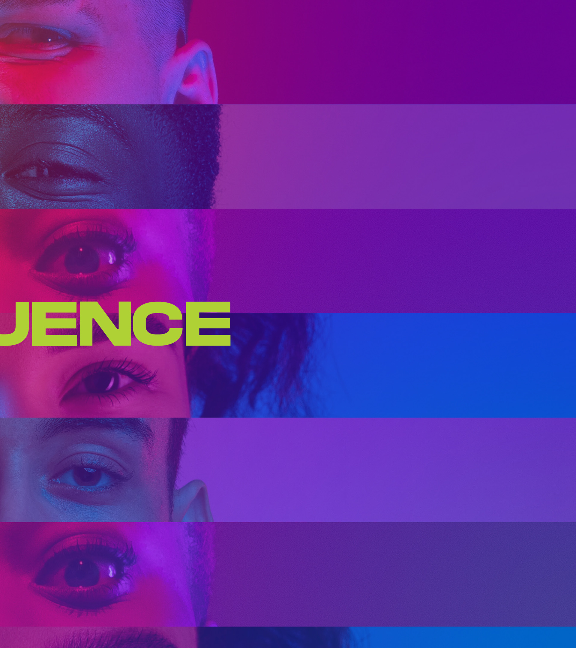
Frequence
Services: Branding, Social Media Presence, Artistic Direction
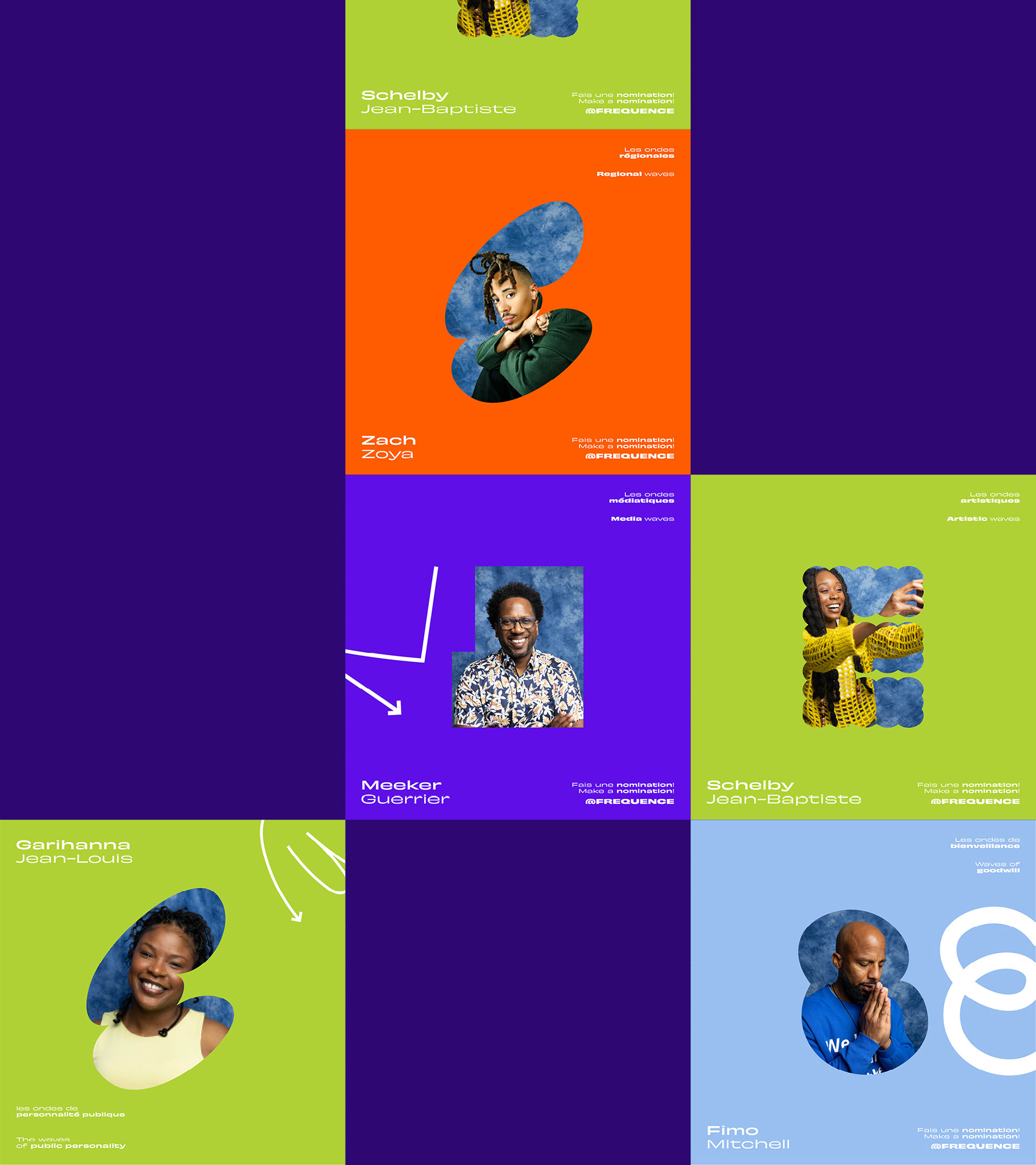
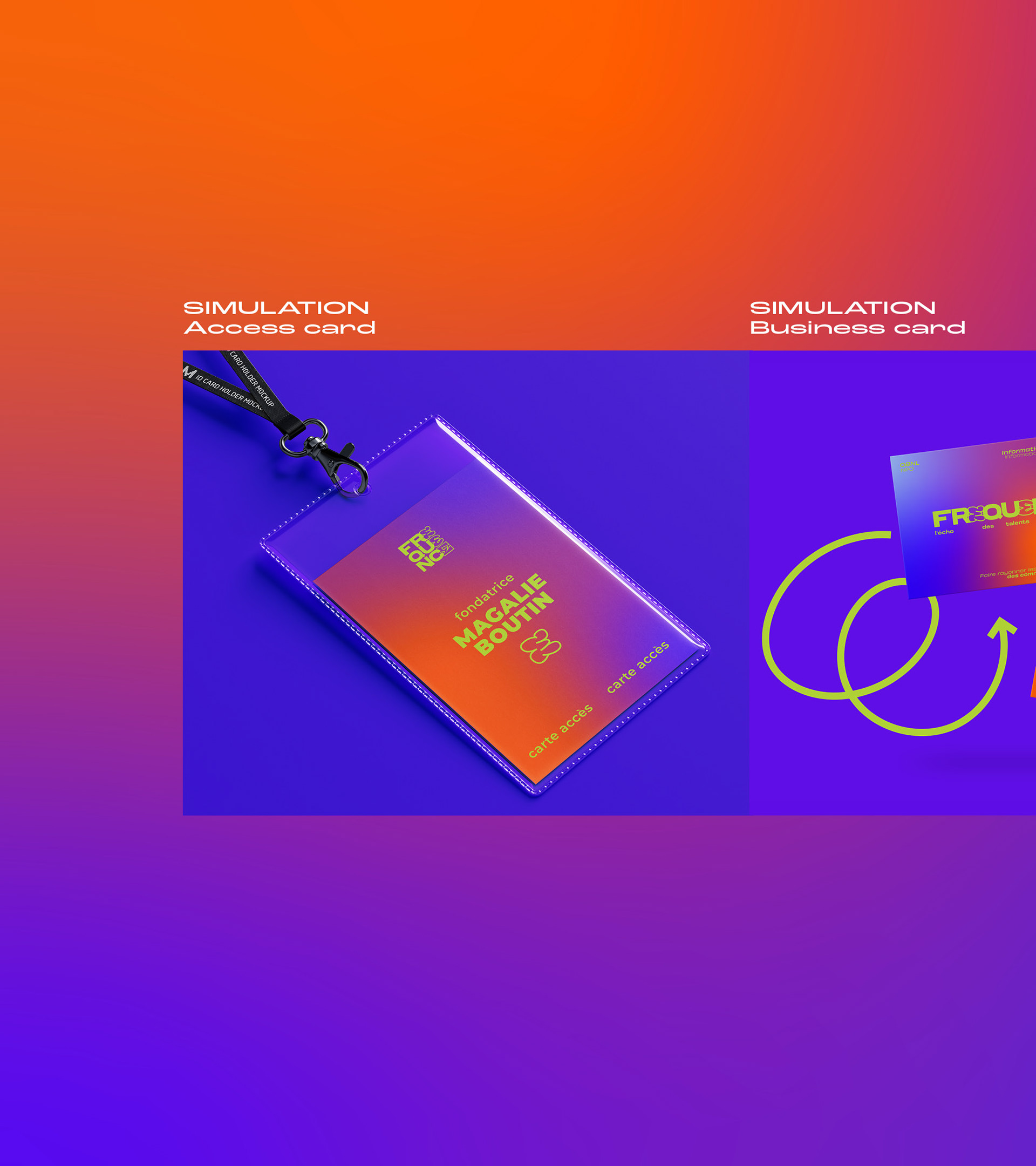
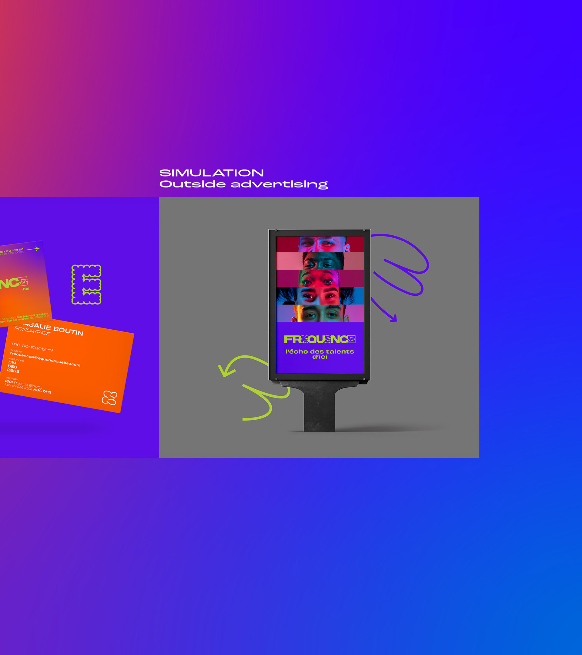
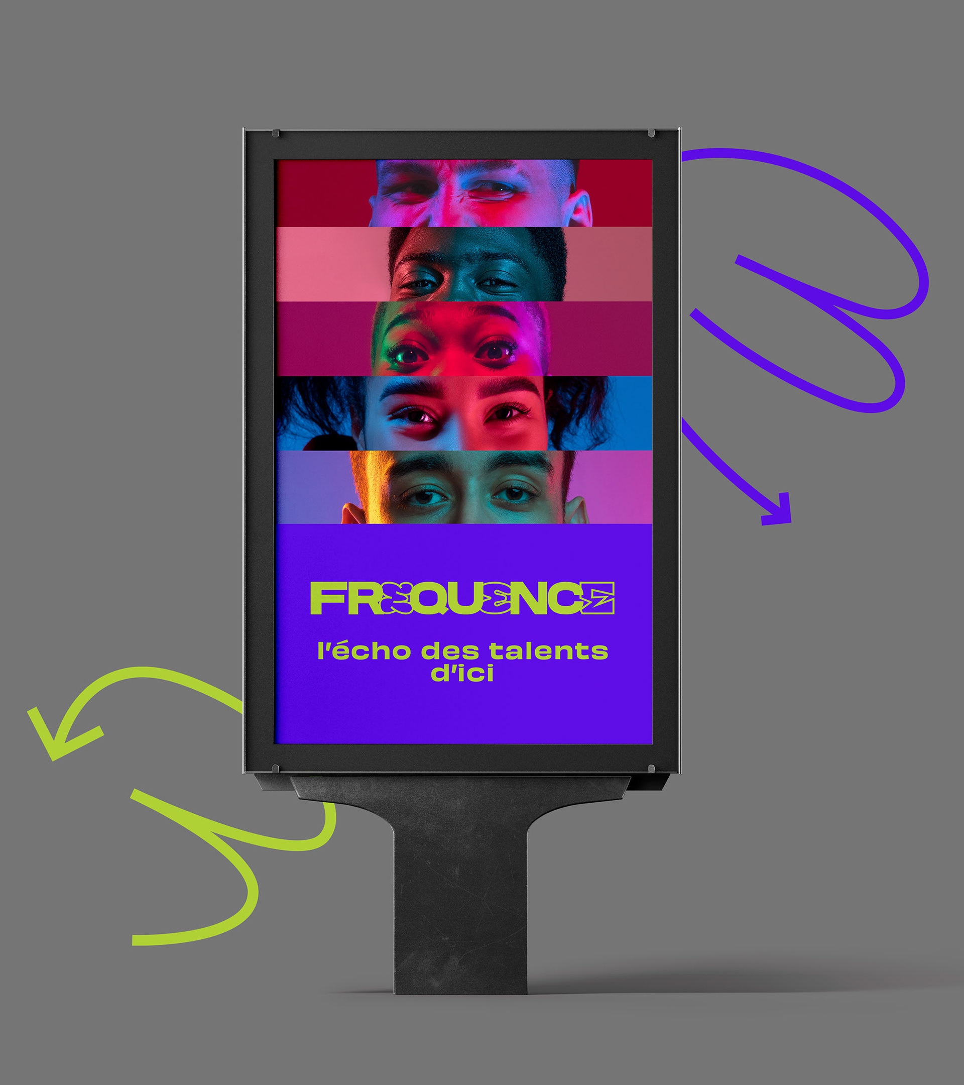
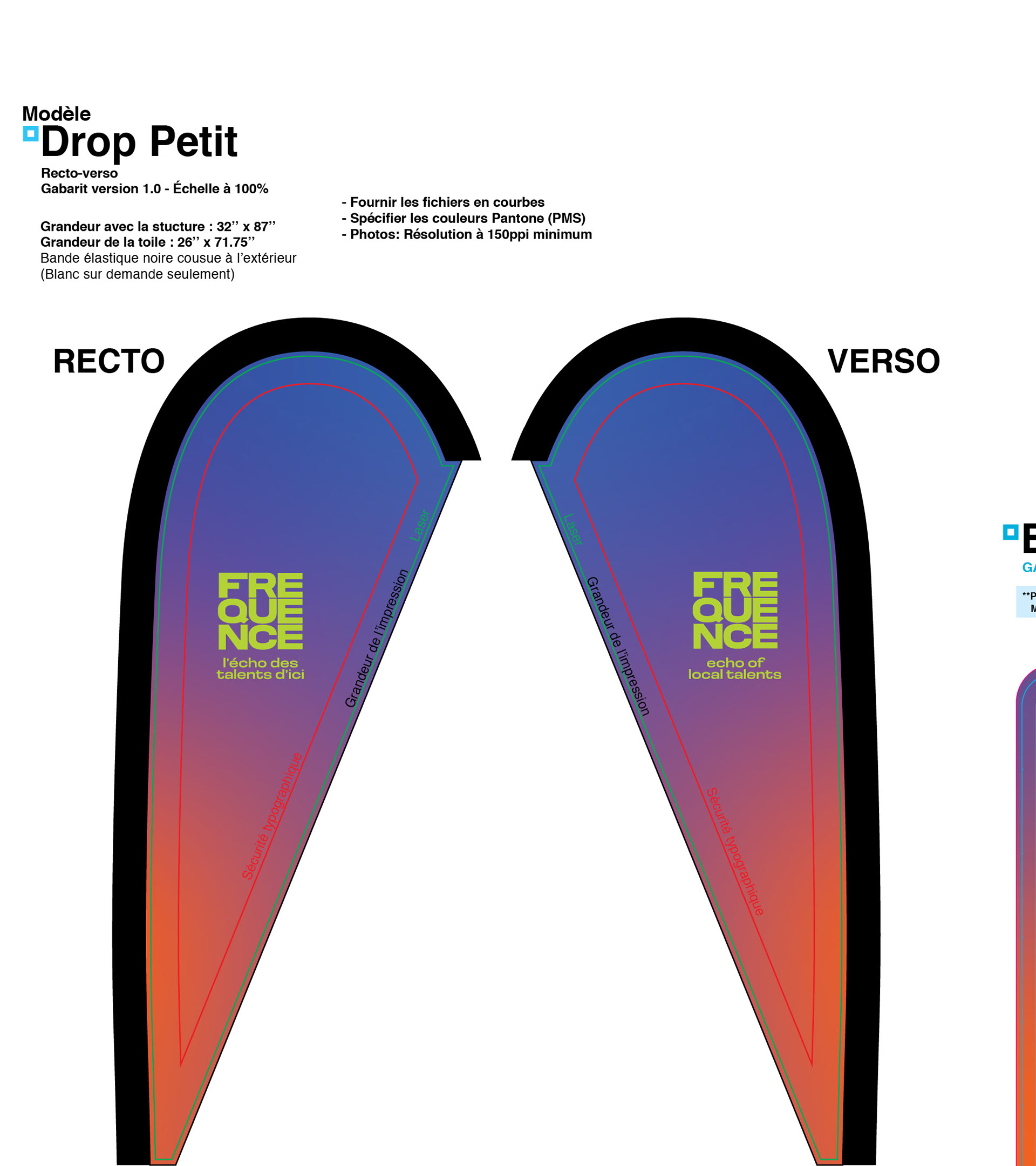
Electronic Advertisement and Printed Advertisement
Electronic Advertisement and Printed Advertisement
Software used:
Illustrator, InDesign, Photoshop, XD Adobe, Figma, Adobe Express
Illustrator, InDesign, Photoshop, XD Adobe, Figma, Adobe Express
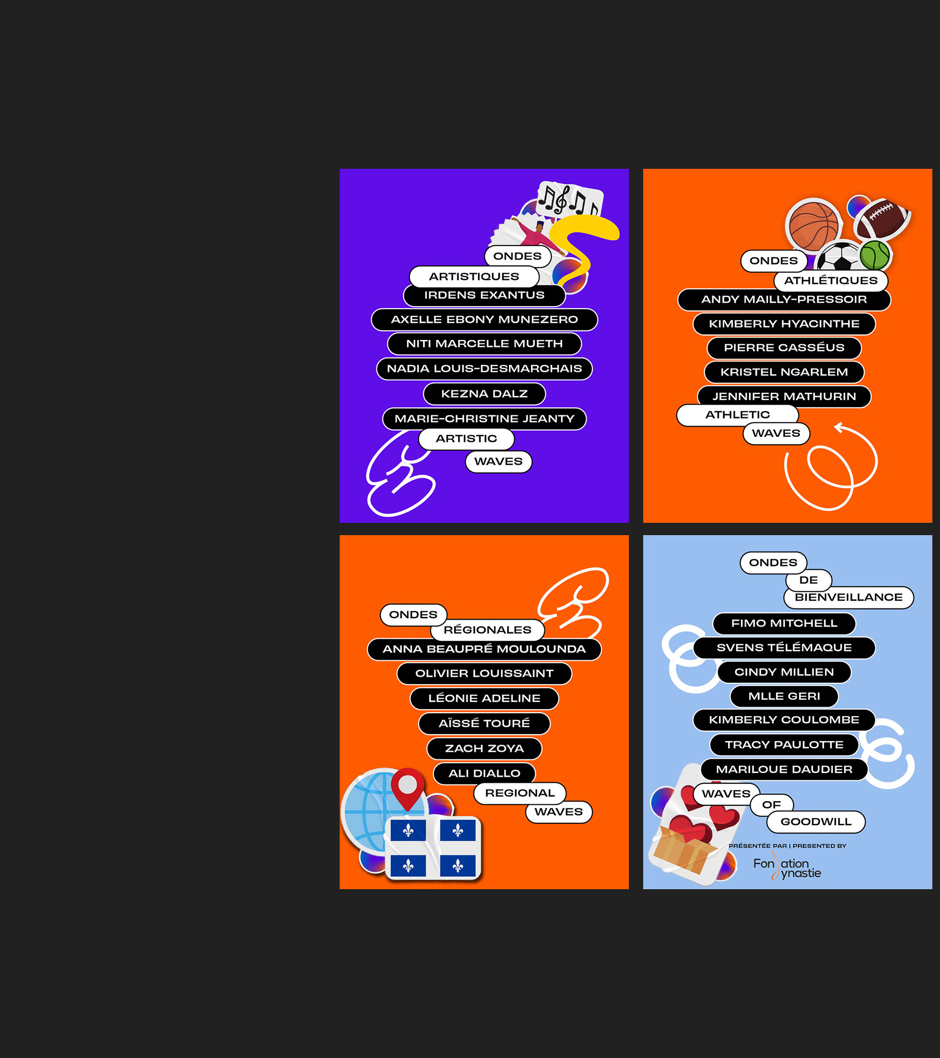
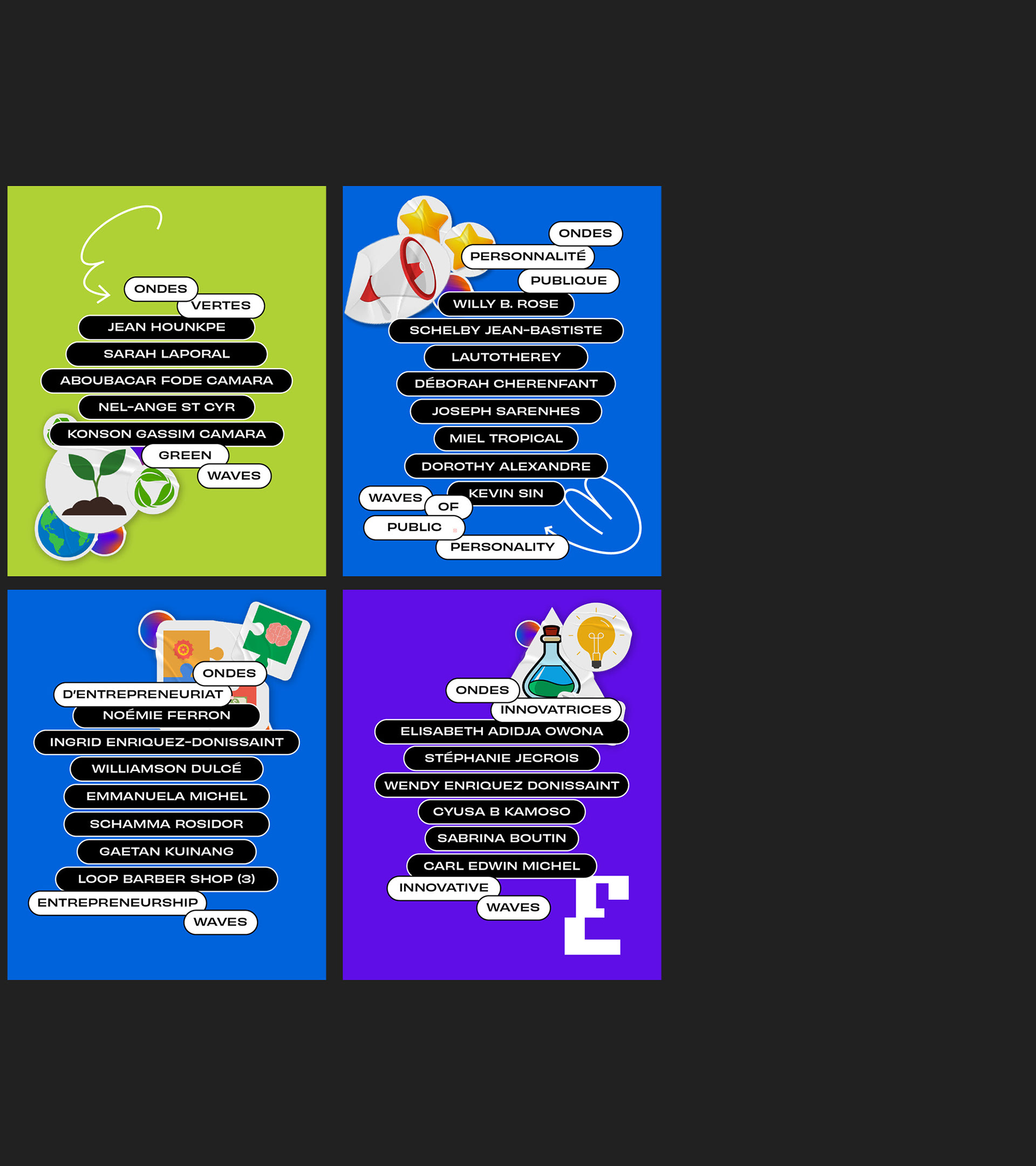
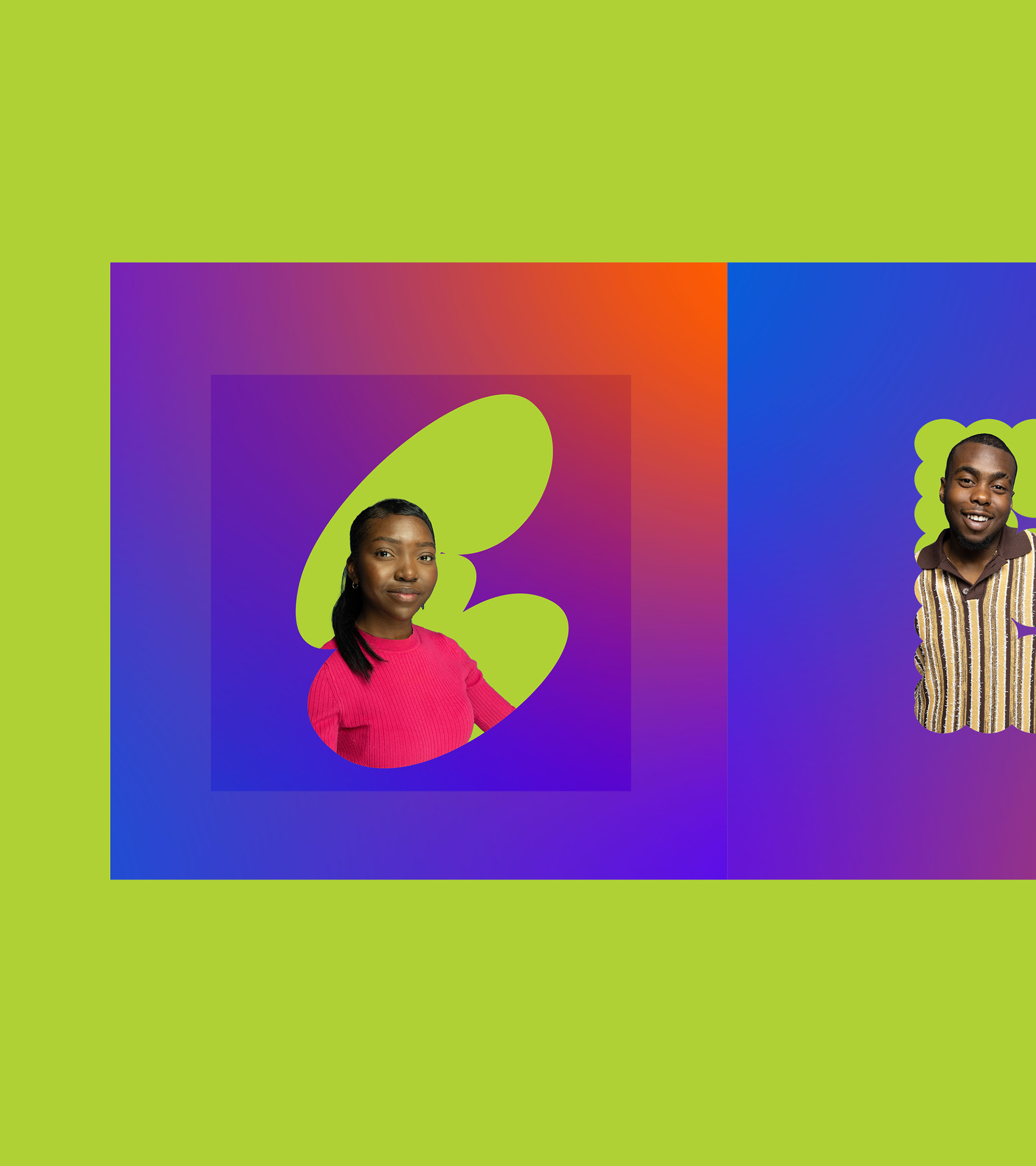
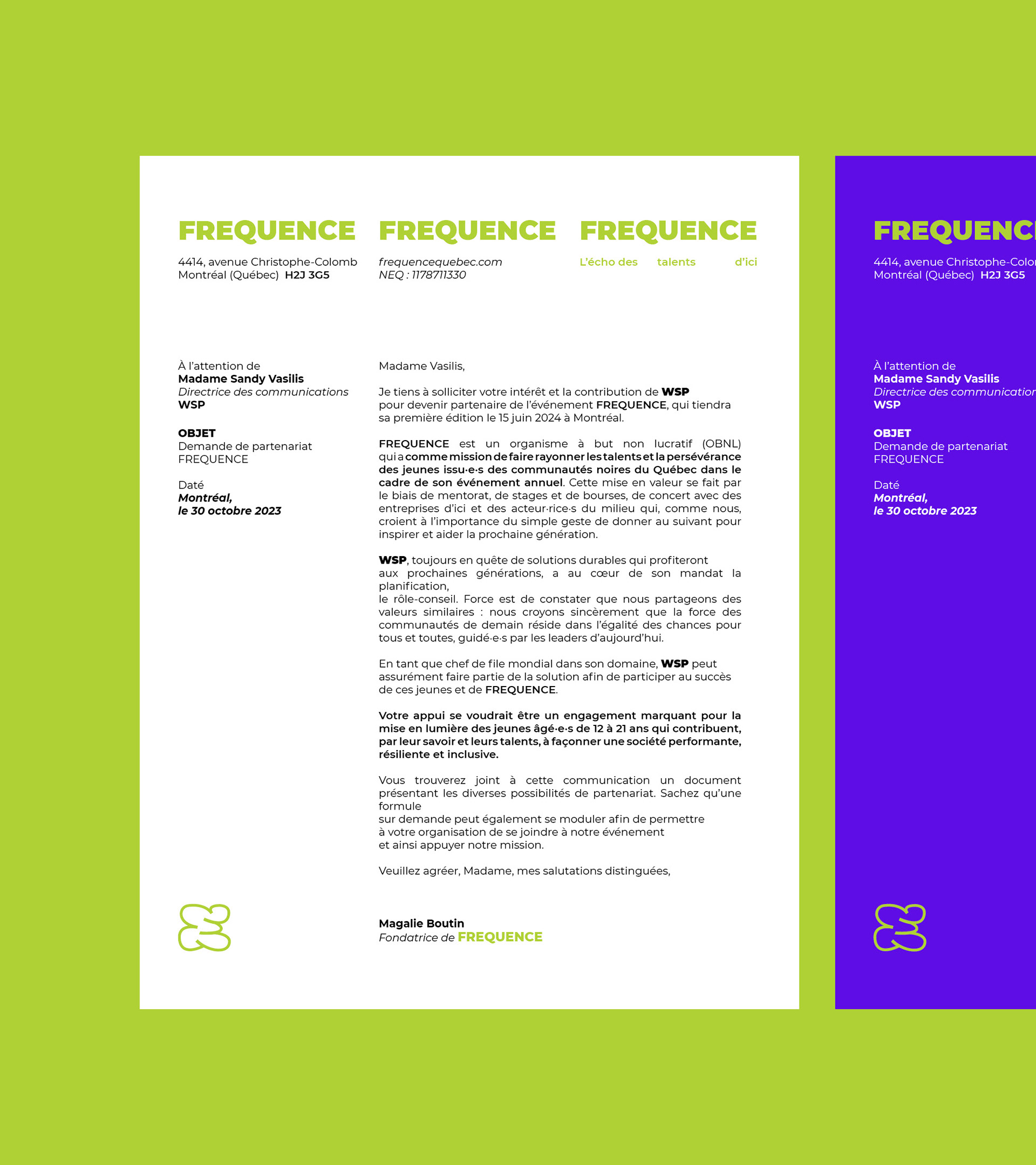
FREQUENCE is a non-profit organization thatshowcases the skills and perseverance ofyoung Quebecers from Black communities. Weprovide Black youth with a forum to expressthemselves and share their experiences andperspectives. Together, we’re creating a brighter,more inclusive future and society.
As part of its program, which includes the annual FREQUENCE event, the focus on young people aged 12 to 21 is to change the way Quebec's Black youth are viewed, and to support their efforts as agents of change through mentoring, internships and assistance with personal development and career advancement.

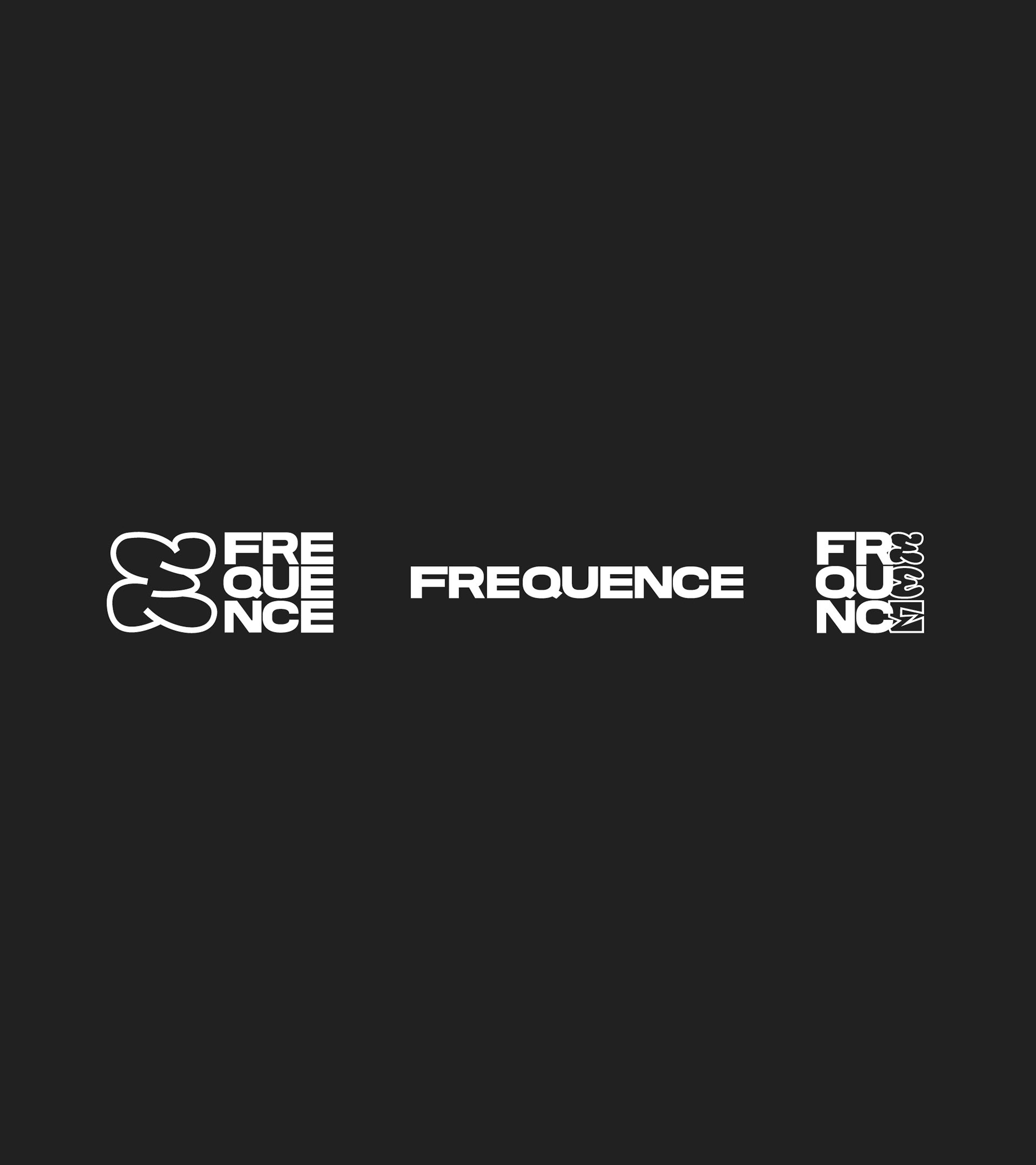
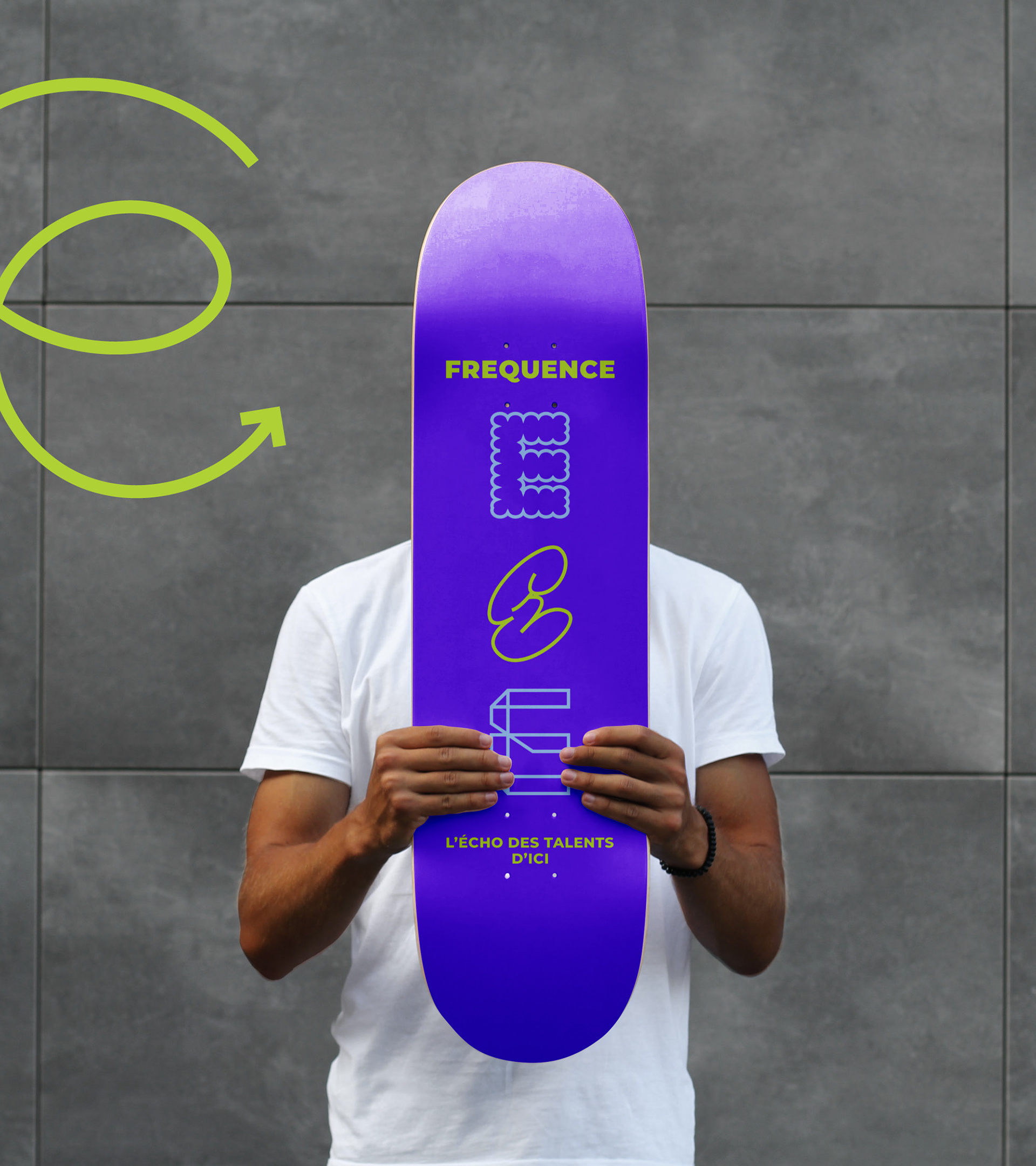
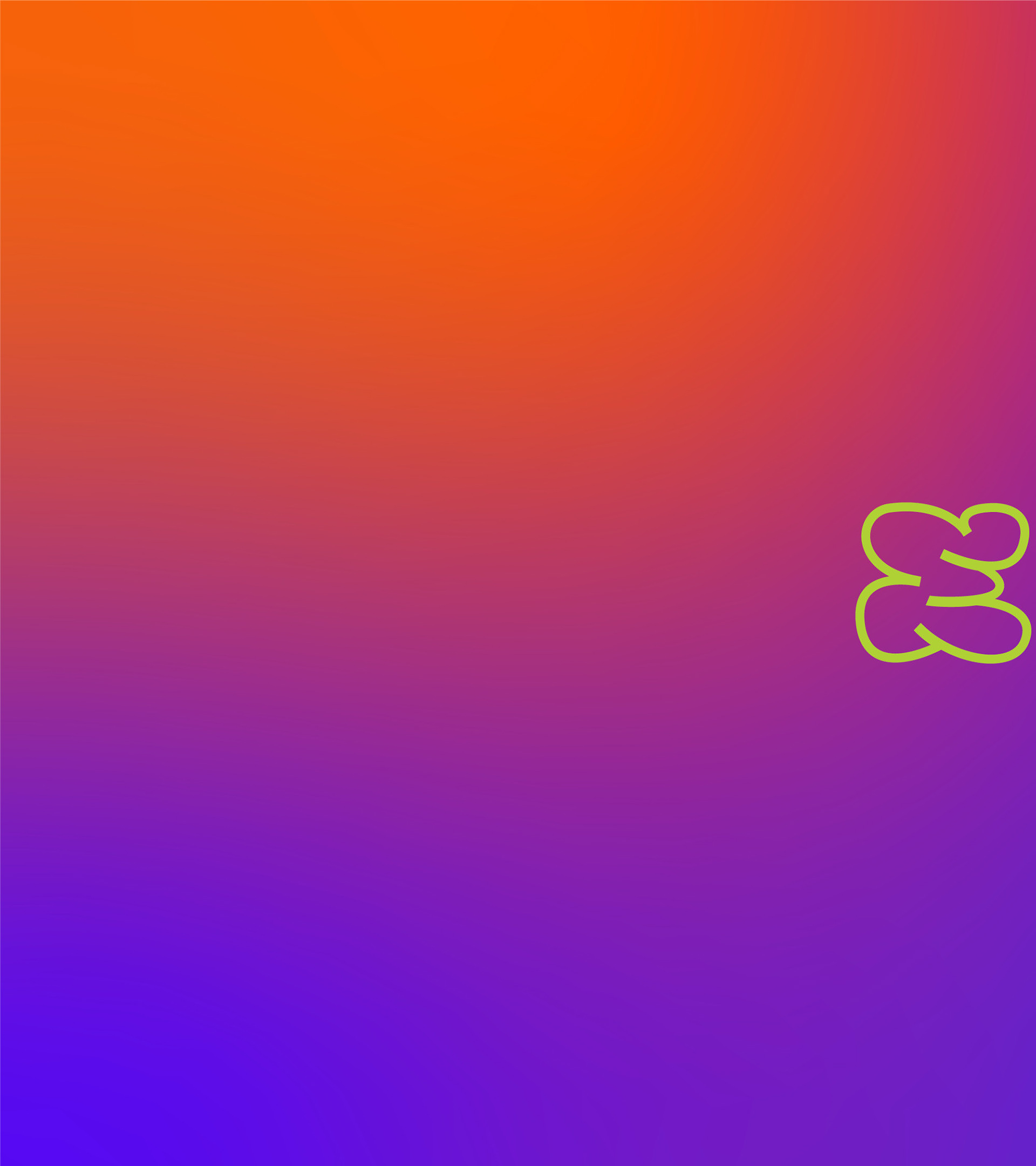
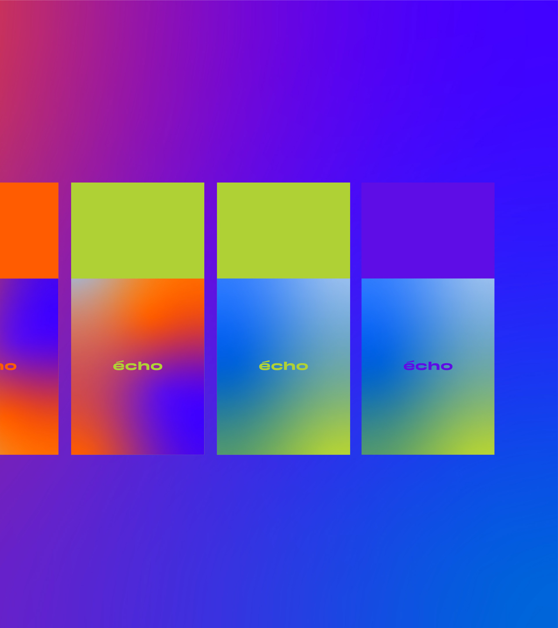
Idea behind the logo
The logotype is a visual personification of a frequency. Its stylistic treatments of the letter E enable the brand image to be inclusive and diverse.
The urban style represents youth and Montreal.
It’s fun and offers infinite possibilities.
It’s fun and offers infinite possibilities.
URBAN
INCLUSIVE
TIMELESS
FUN
INCLUSIVE
TIMELESS
FUN
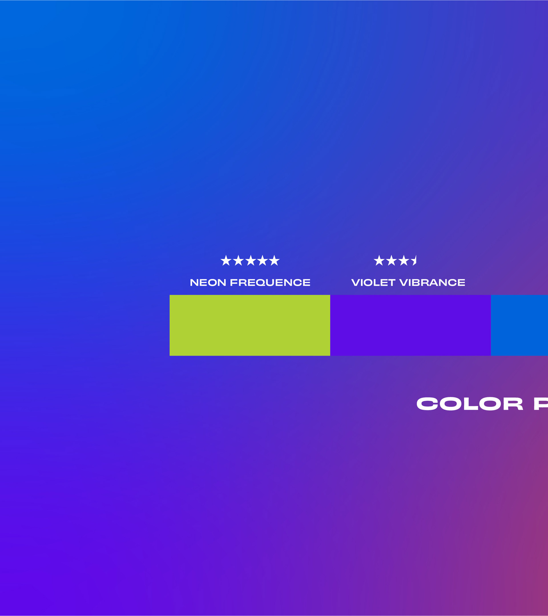
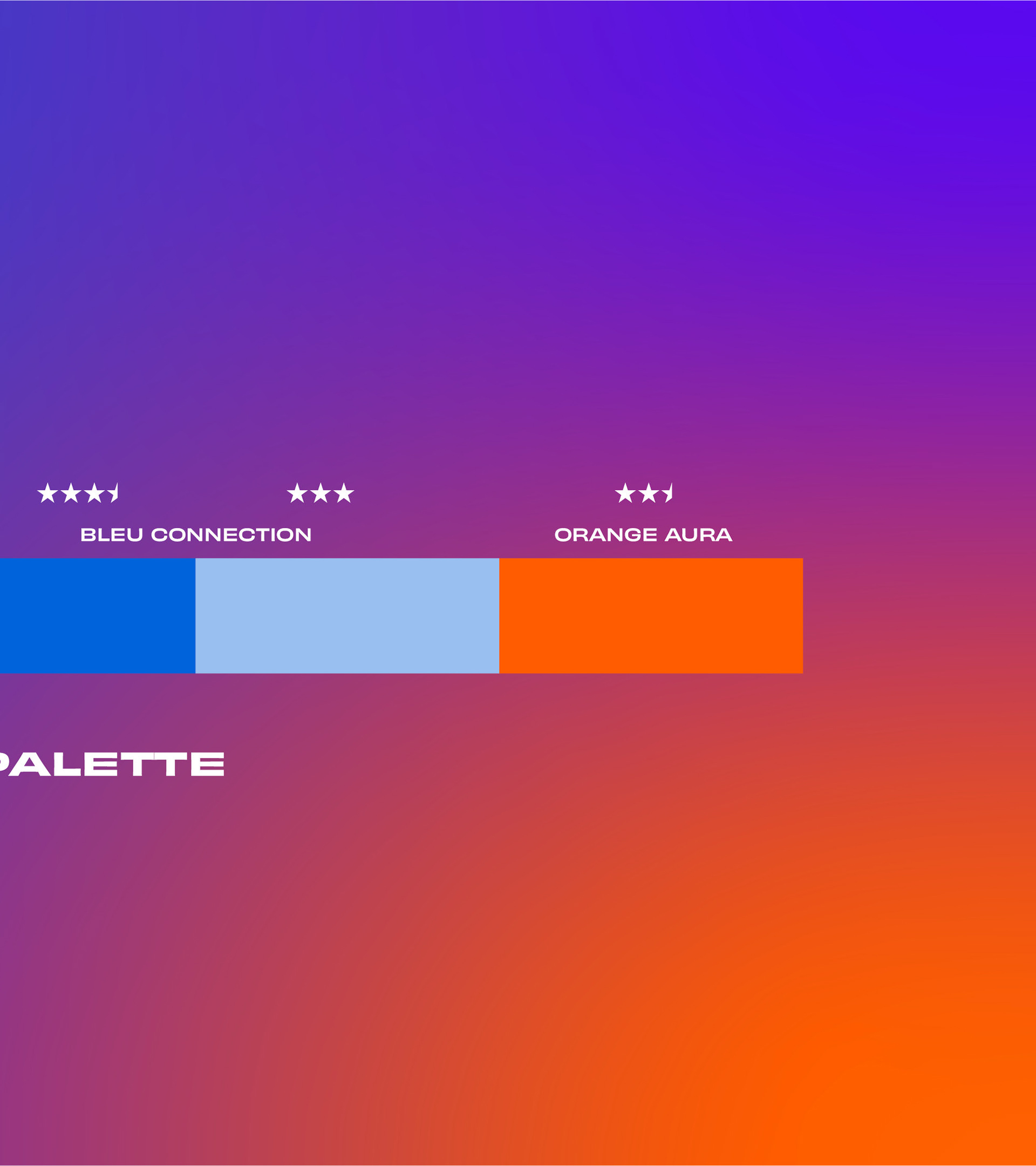
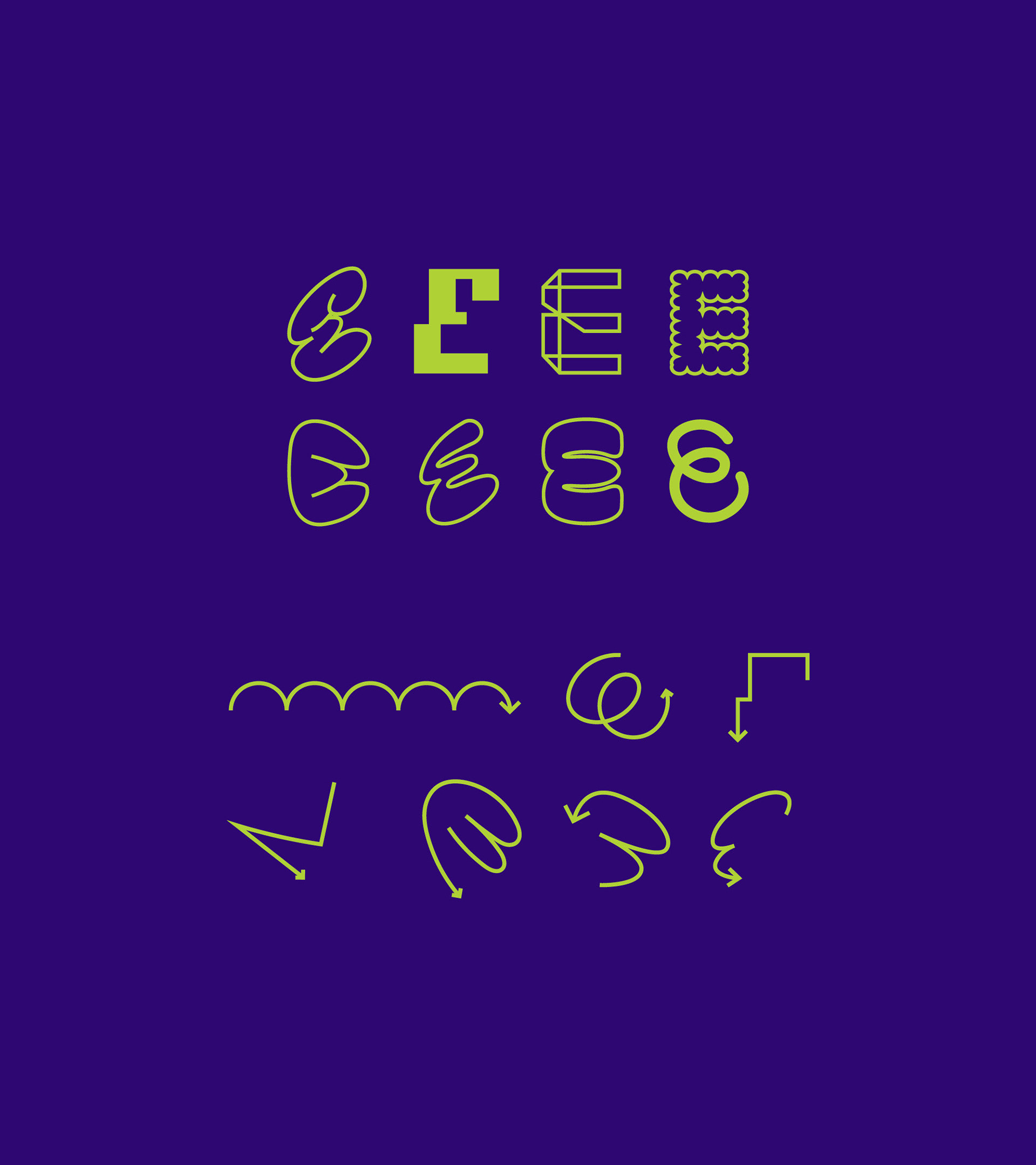
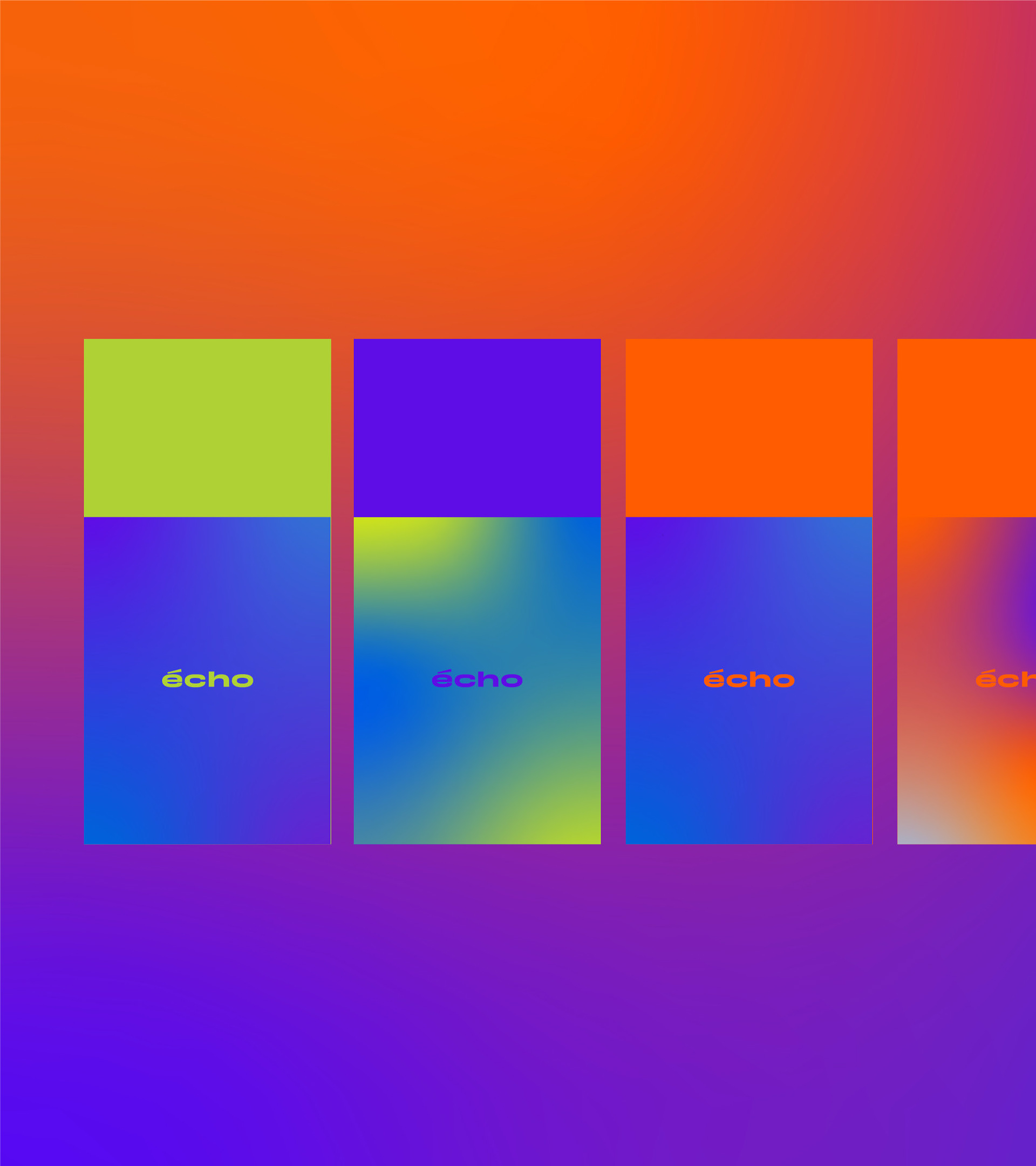
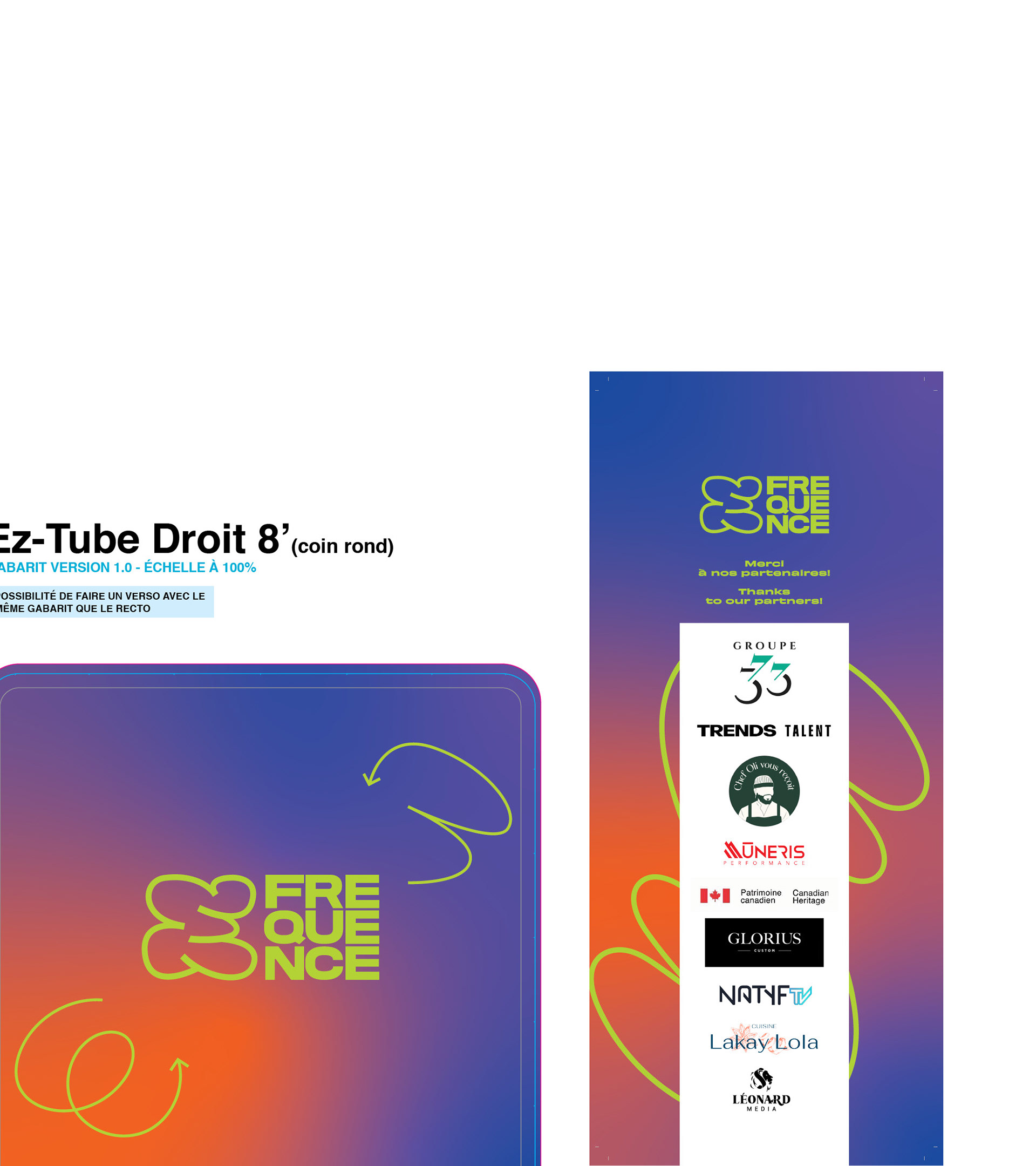
Graphic Elements
E Family & Arrows Family
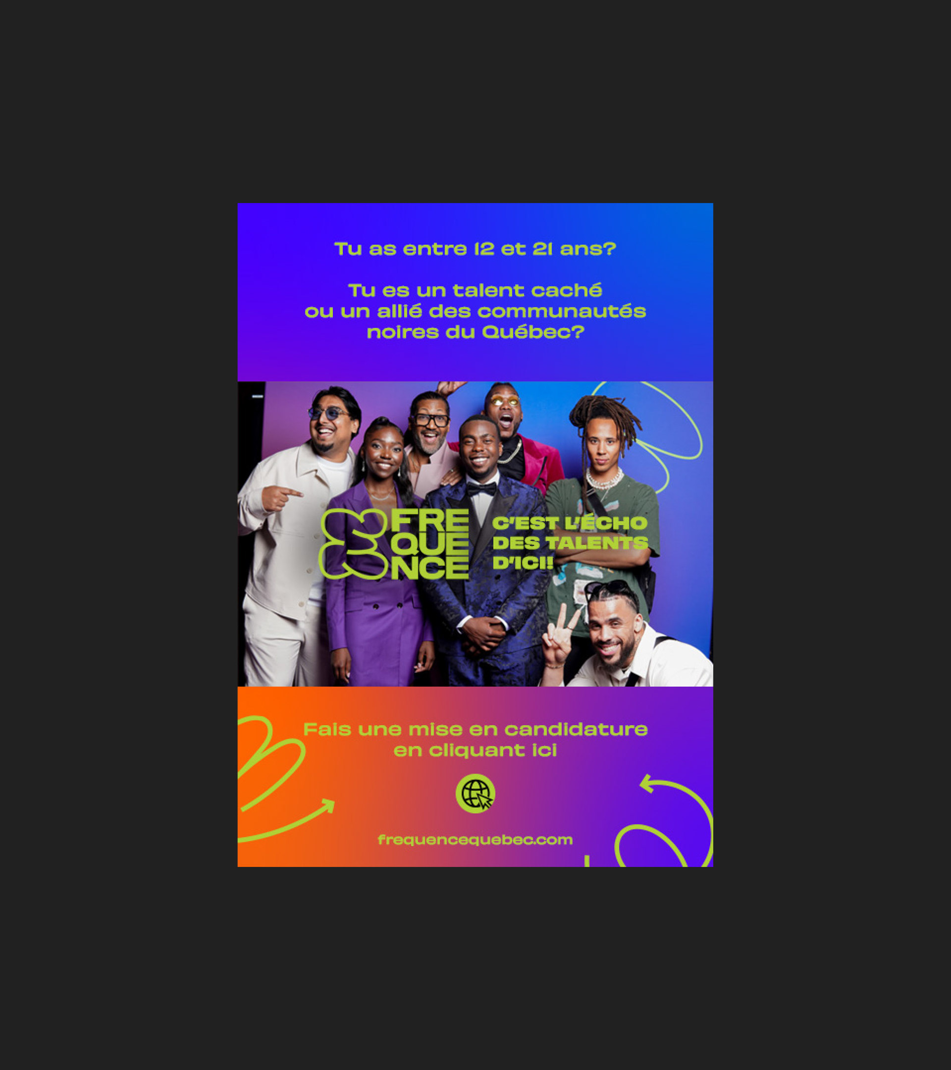
HTML Ad made for LaPresse Website.
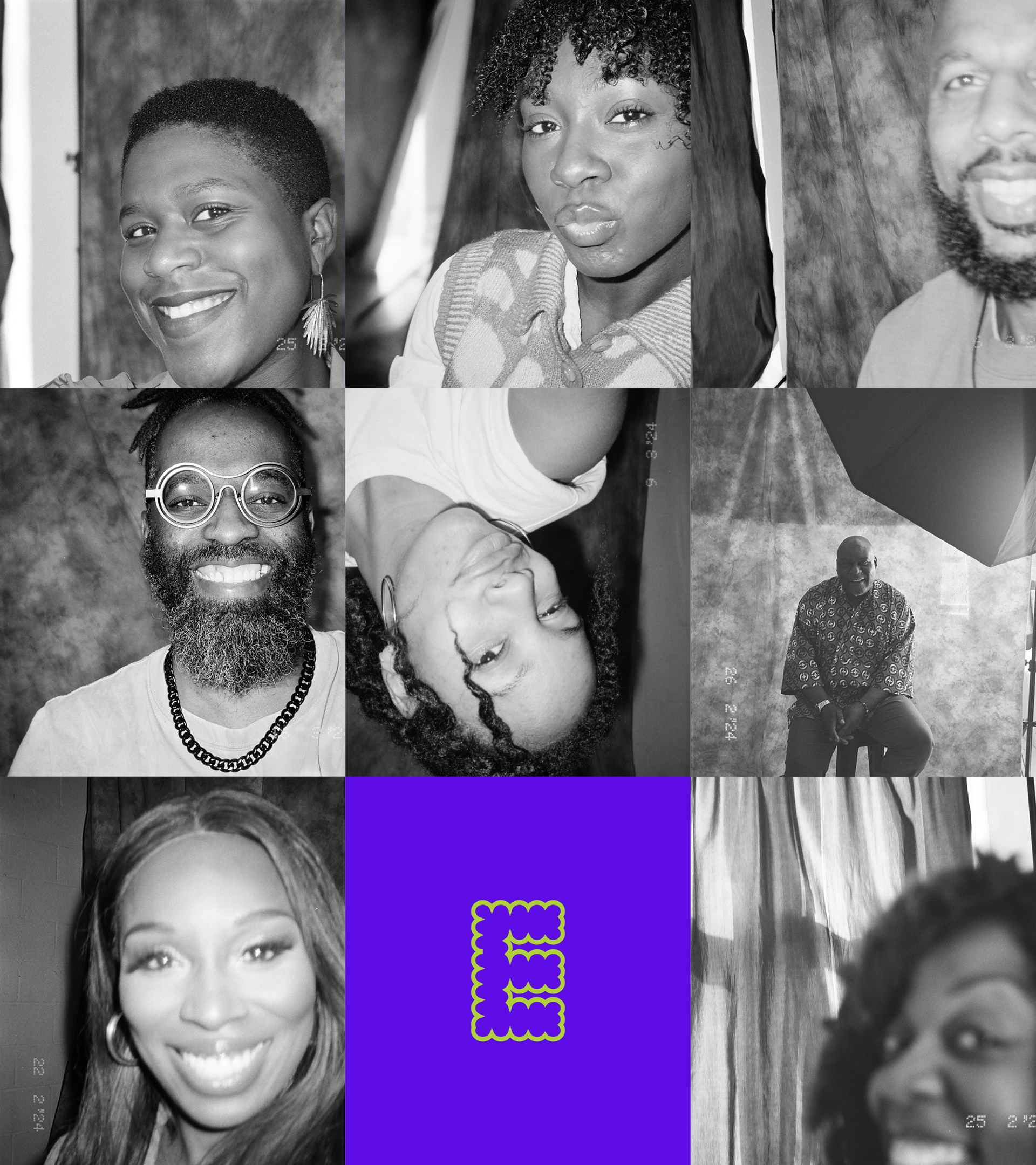
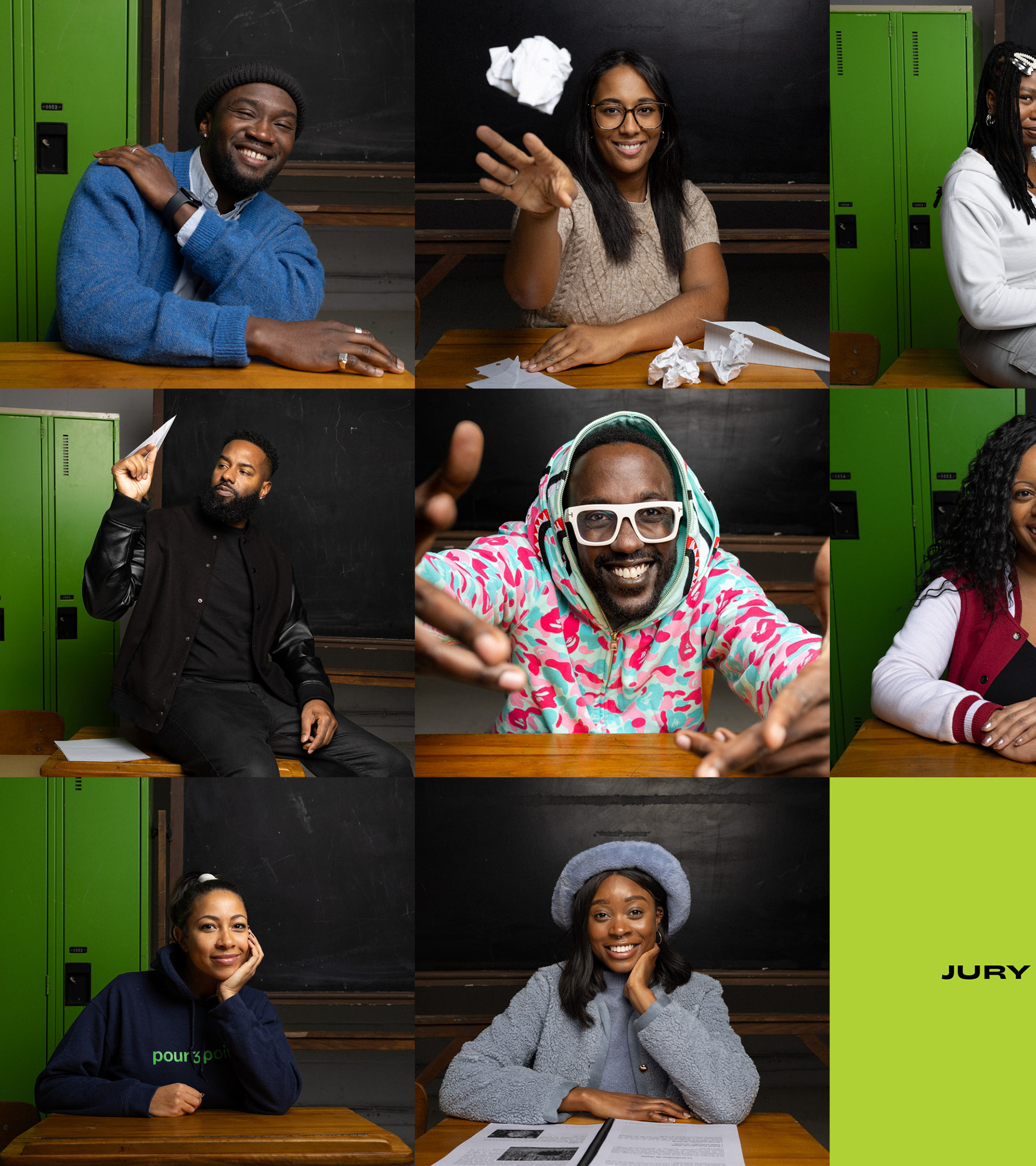
The jury 2024

Printed advertisement for the annual gala
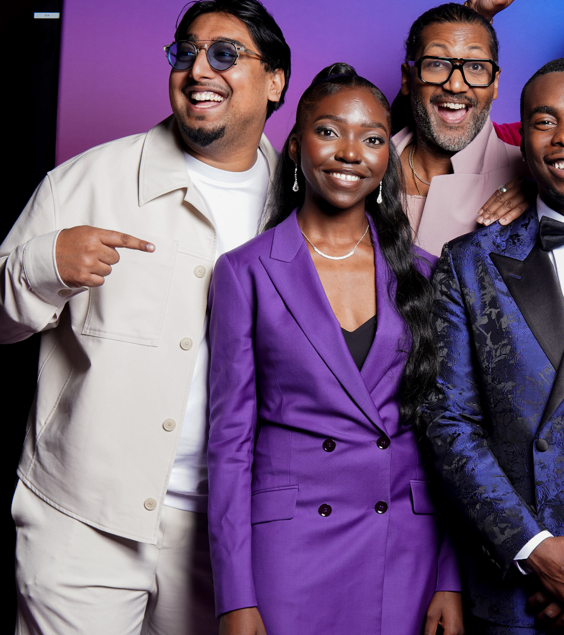
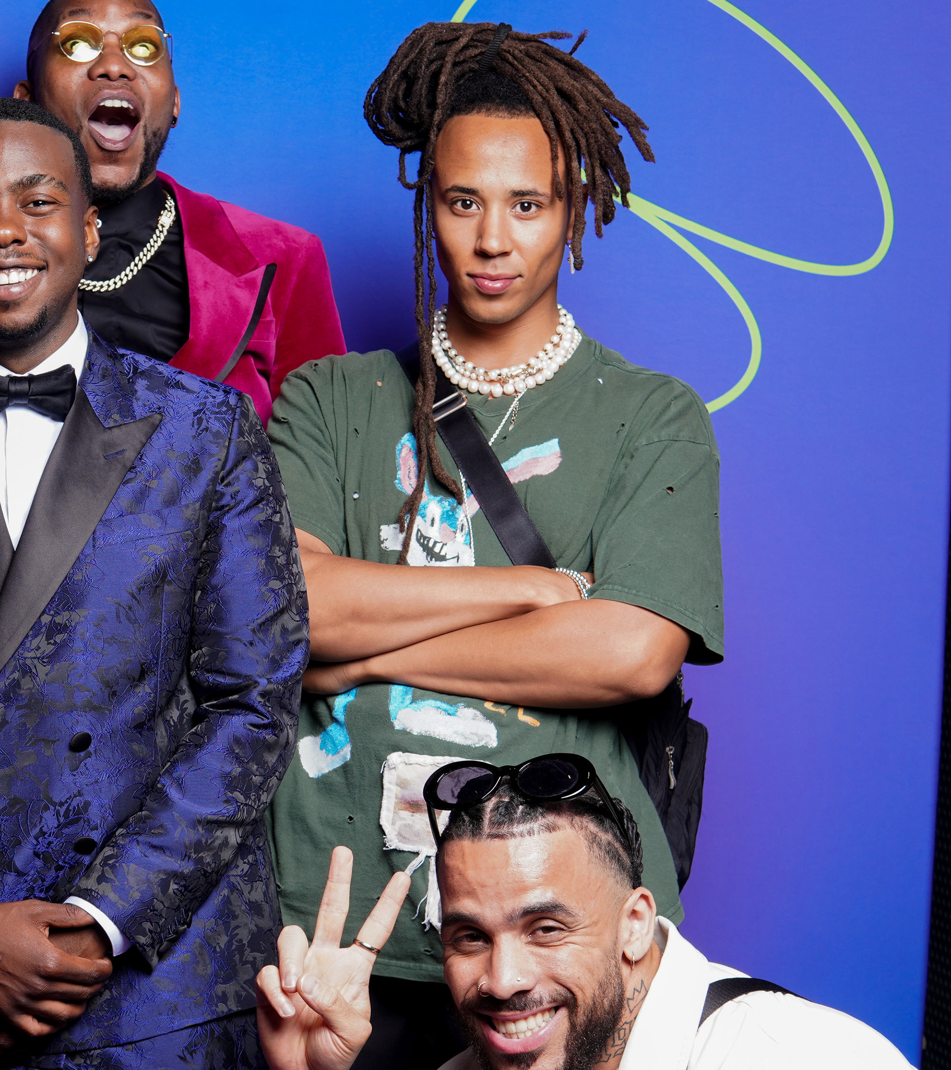
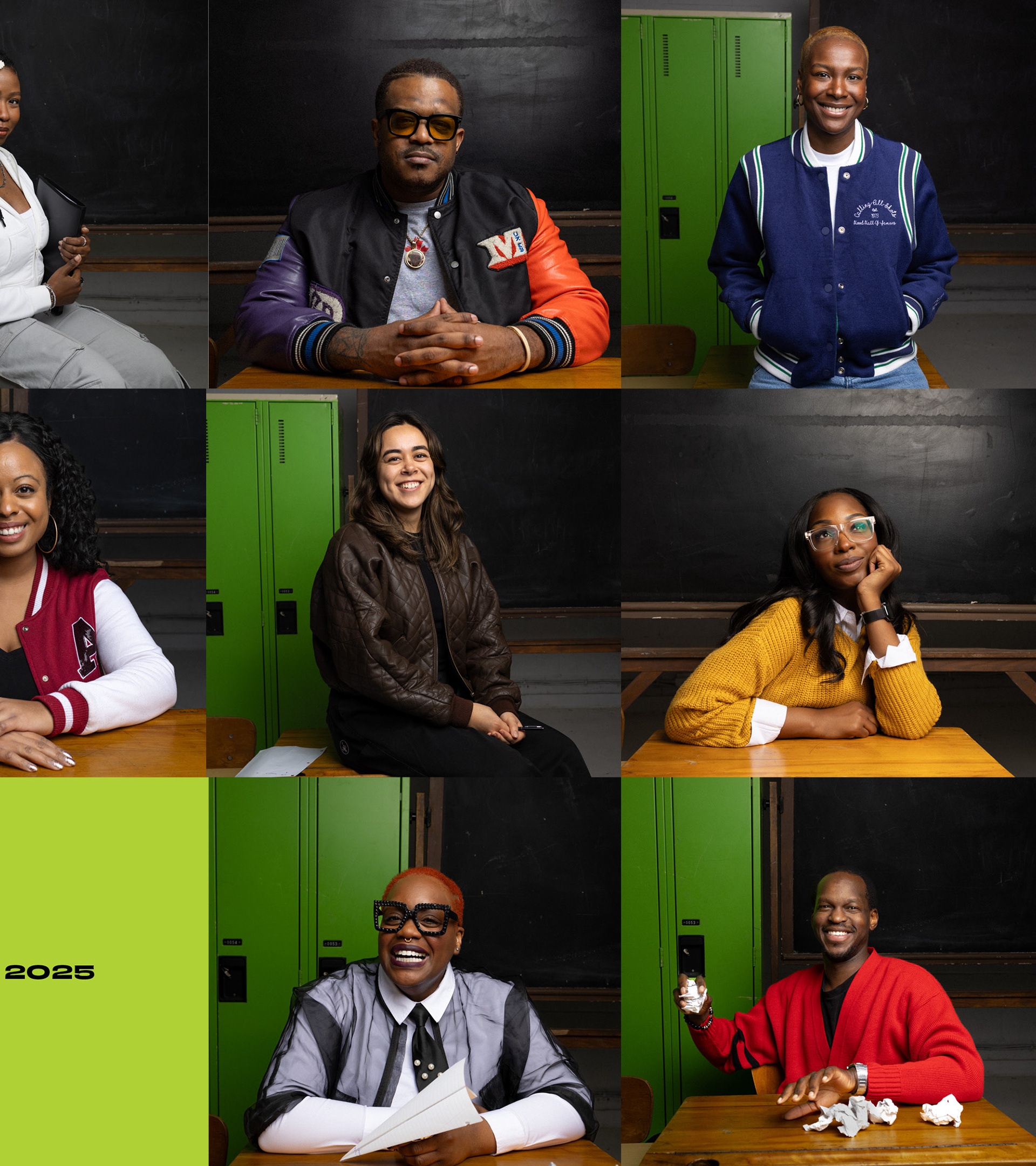
Picture from the previous and first gala.