
GUSTO .
Assignment: Rebranding, SWOT analysis
& UI web design
& UI web design
Software used:
Illustrator, InDesign, Photoshop, After Effects, XD adobe
Illustrator, InDesign, Photoshop, After Effects, XD adobe
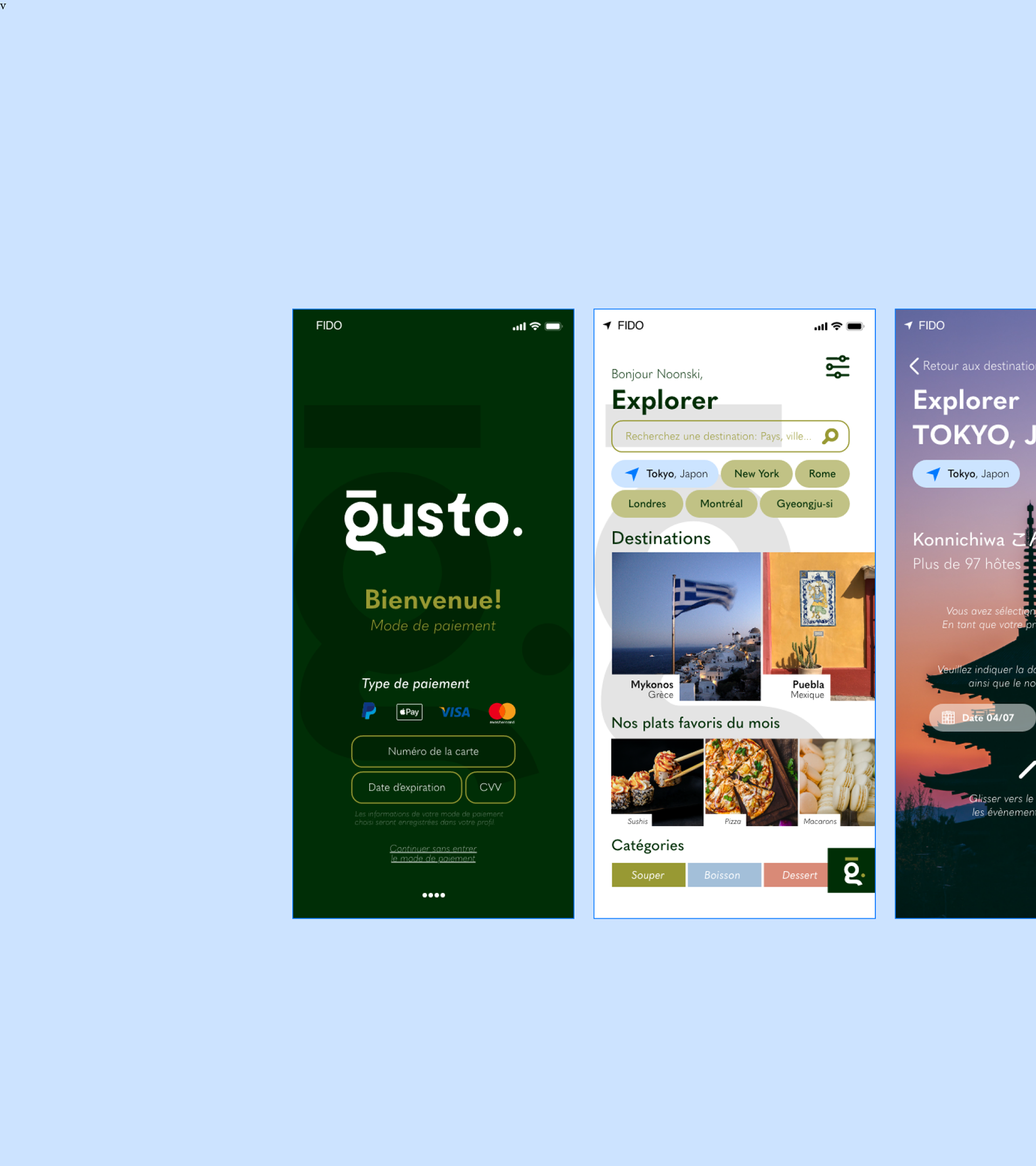
I did this project nearly 5 years ago as part of one of my graphic design courses. It was my first time wearing my brand designer hat. Just like an author weaves words to create a compelling narrative, a brand designer uses visual elements, colours, fonts, and imagery to craft a story that resonates with the target audience.

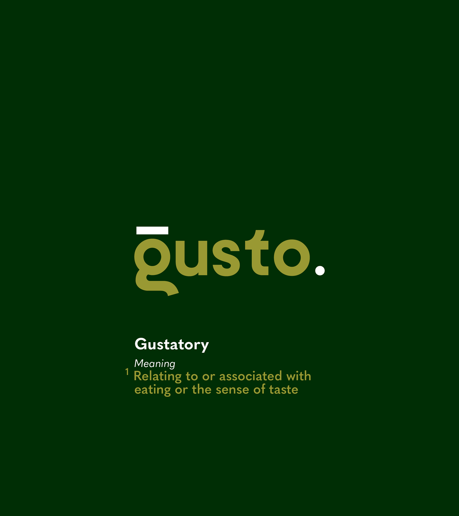
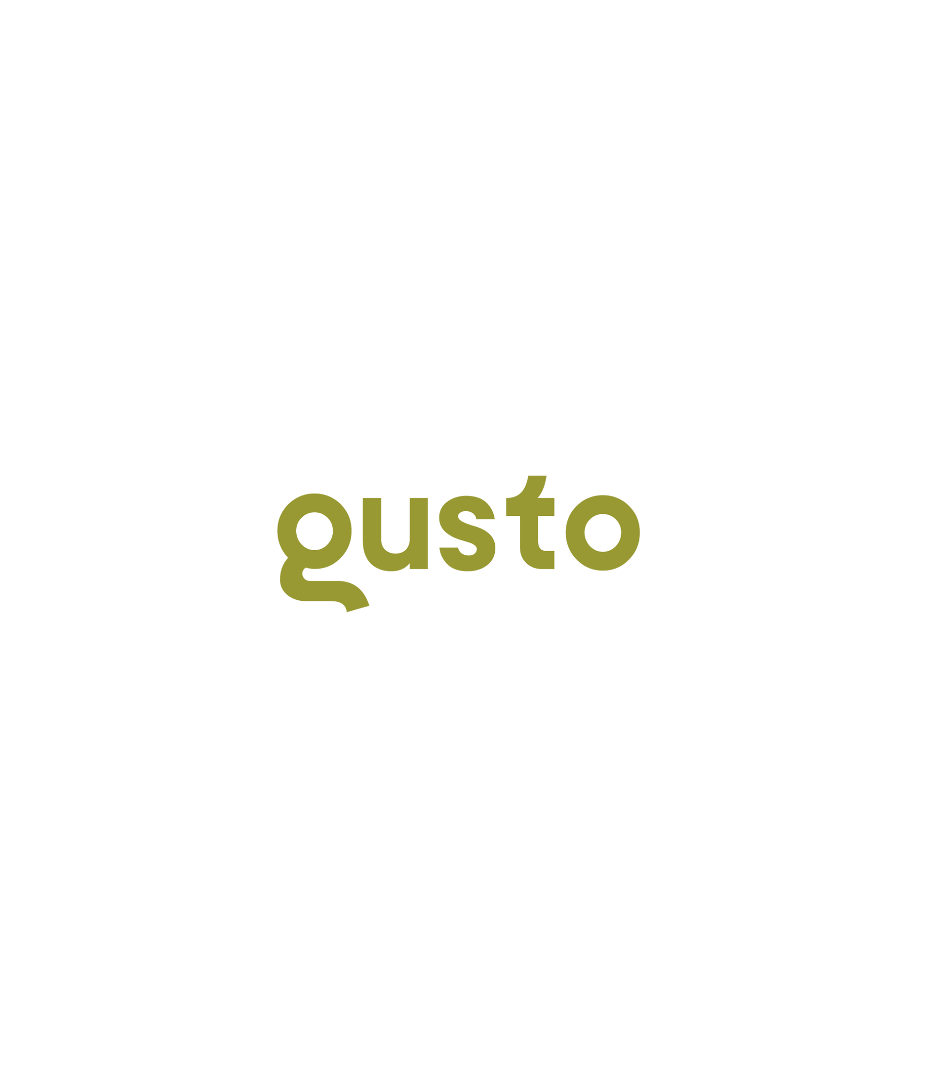
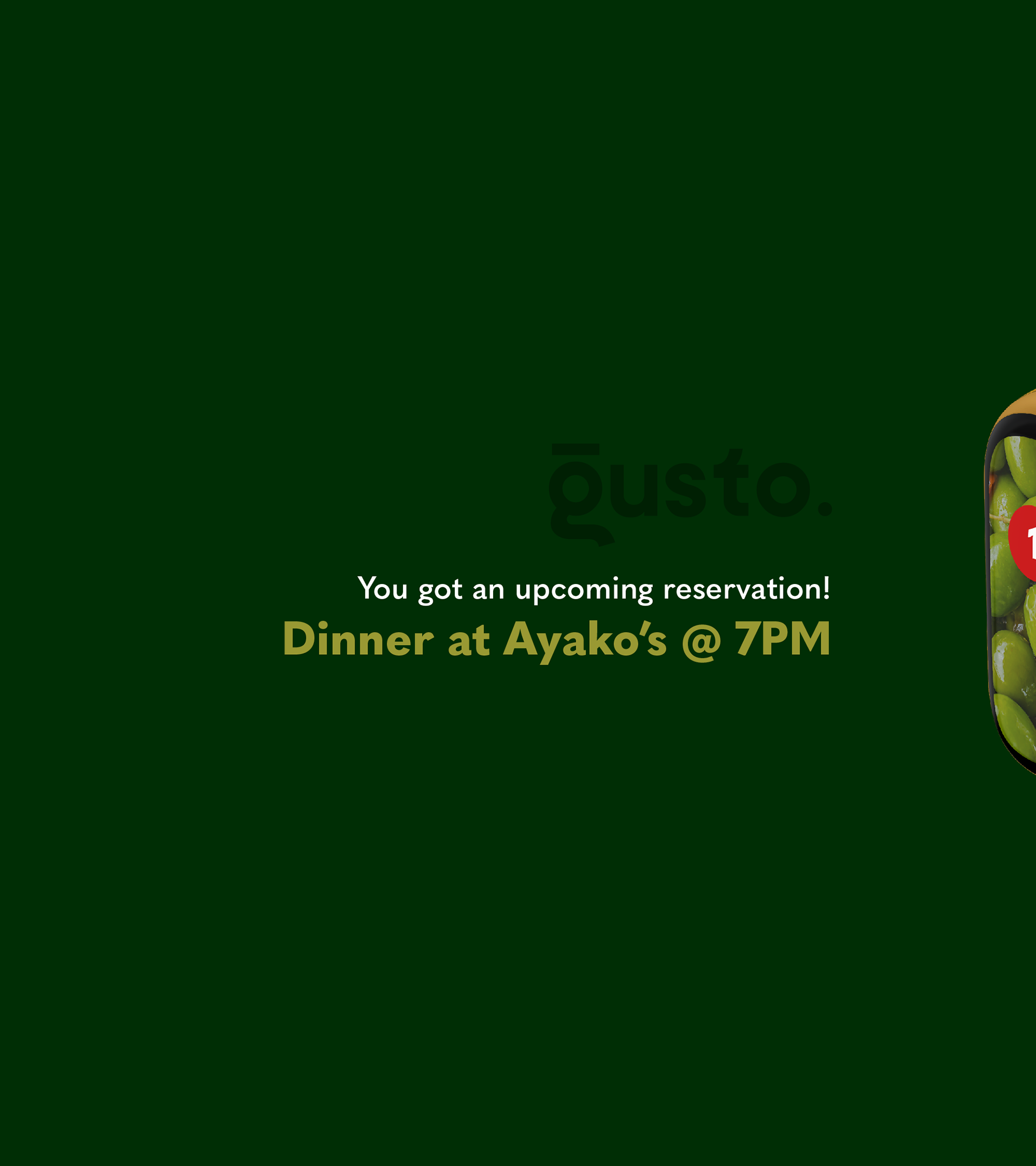
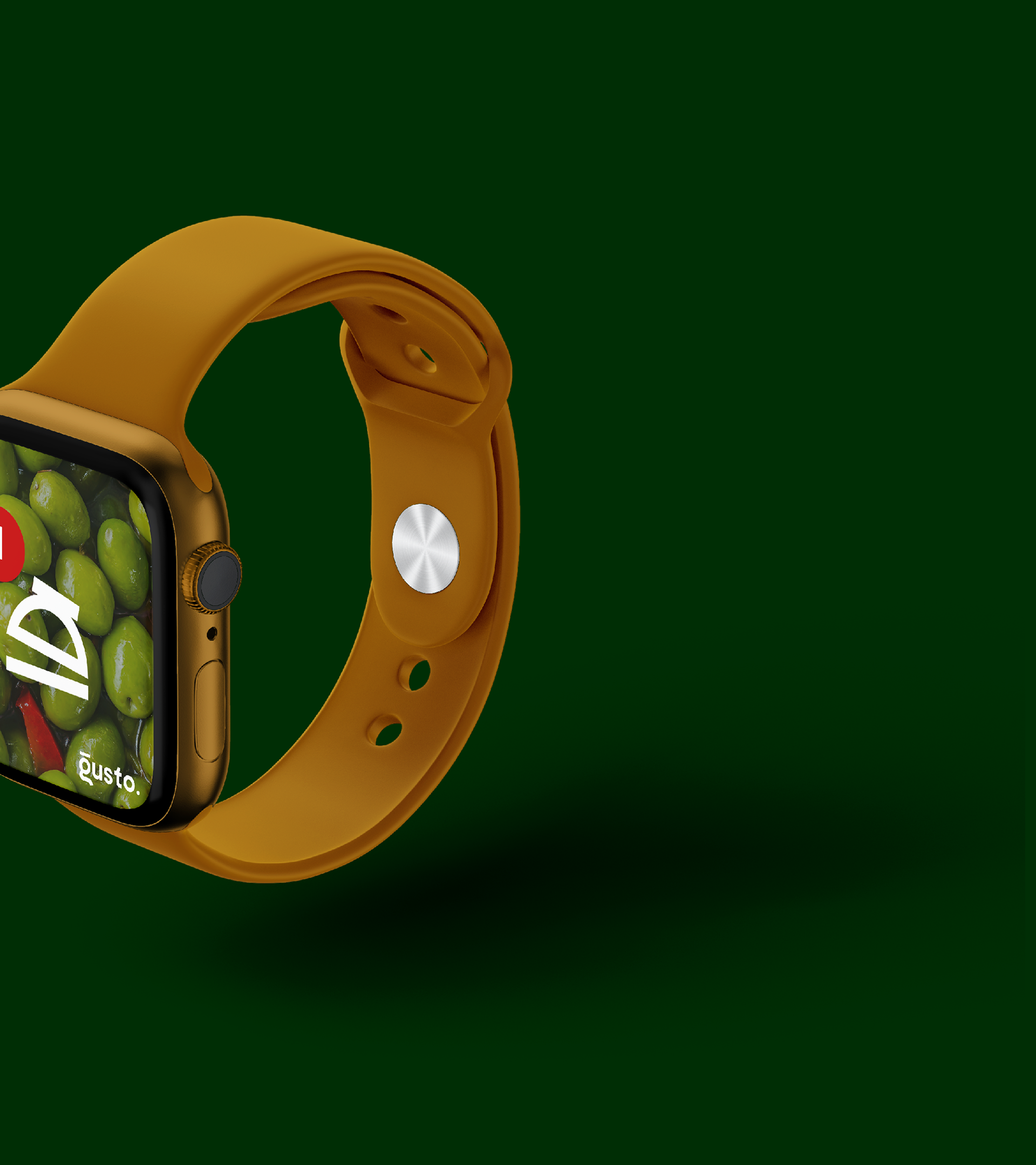
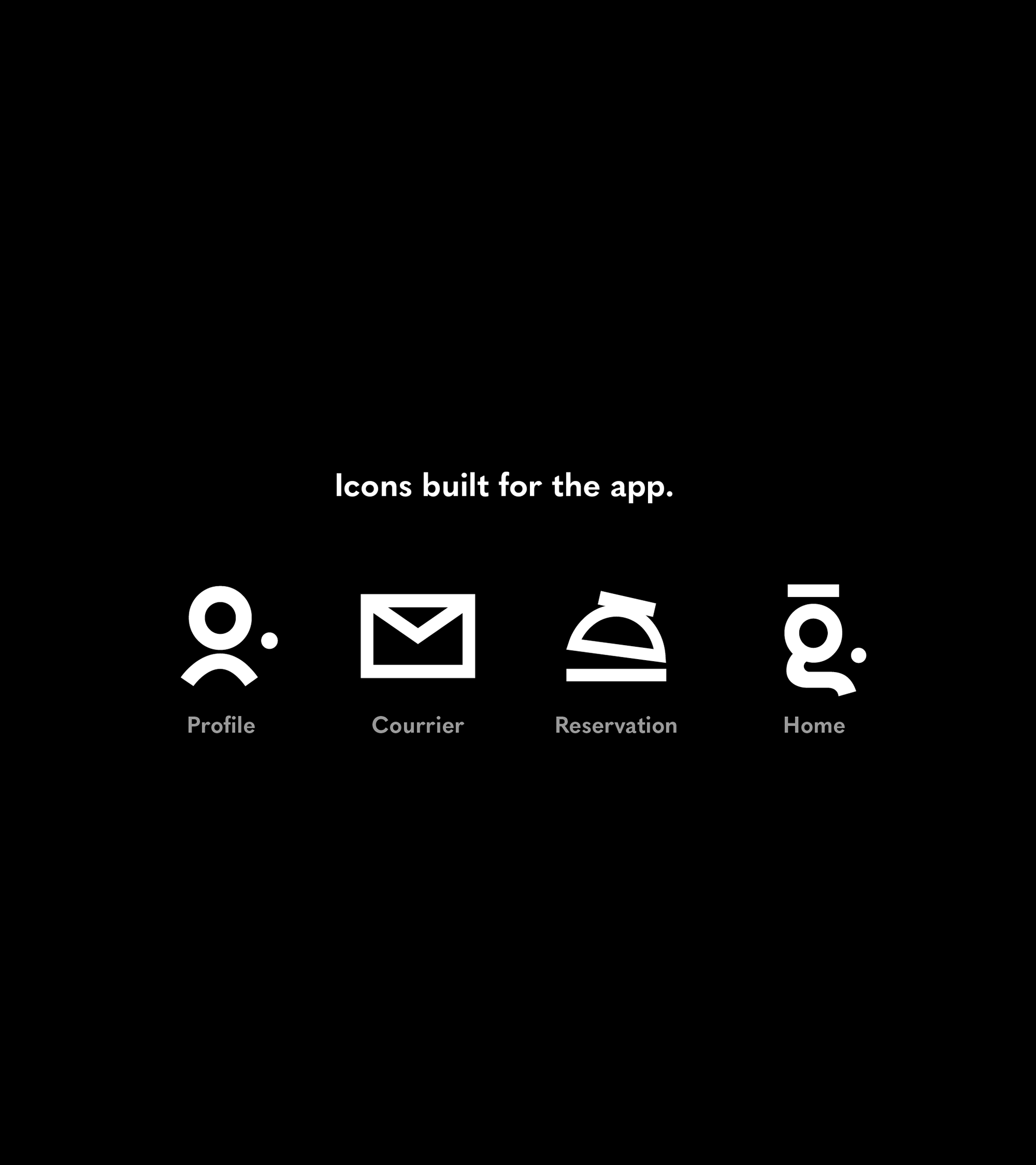
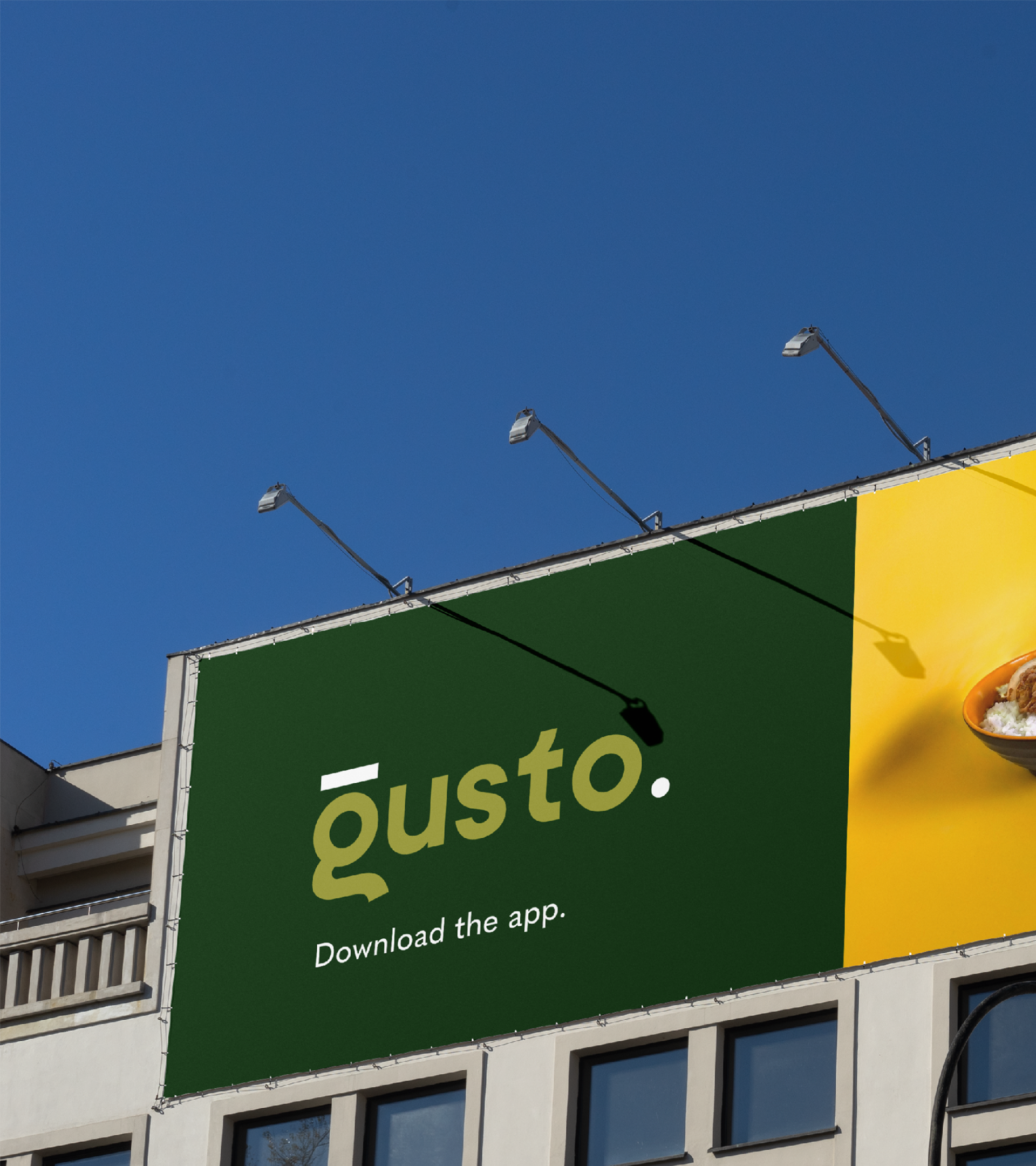
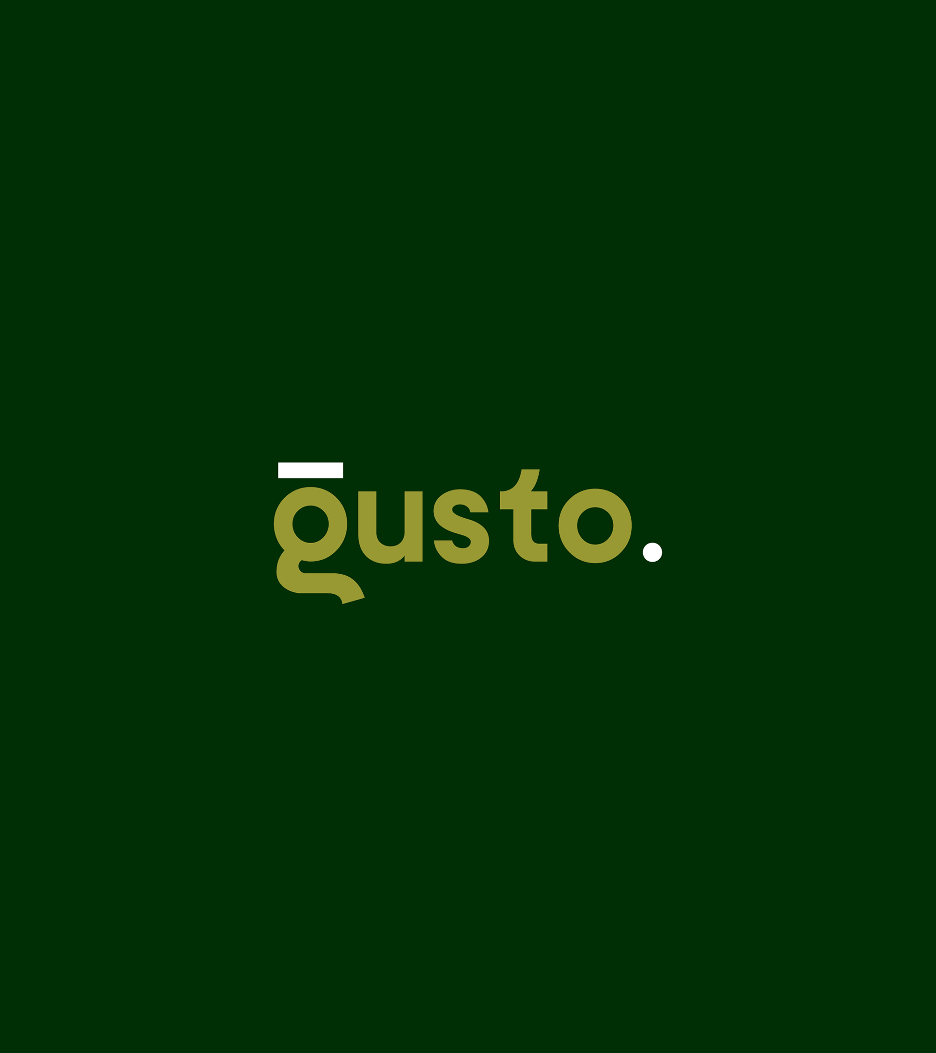
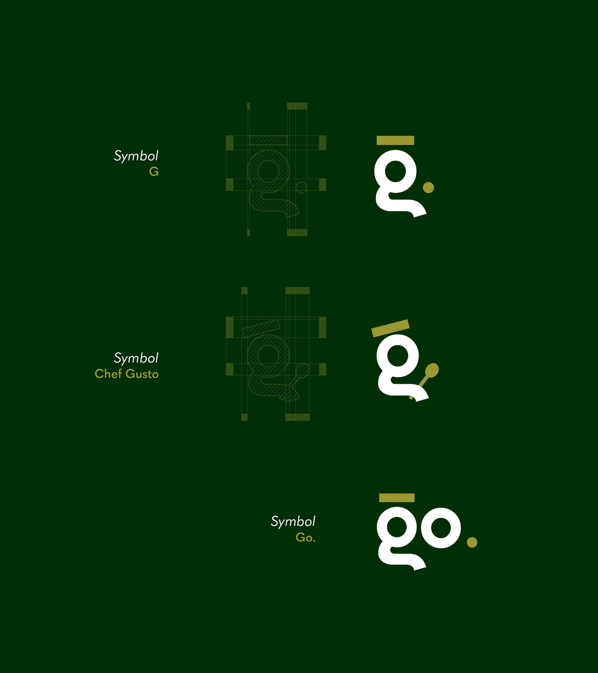
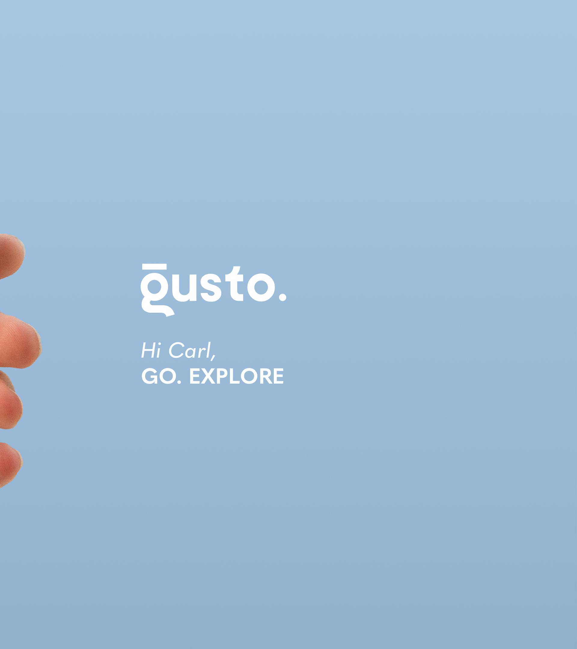
The logo is built around a clever transformation of the letter “G,” which has been reimagined as a subtle human profile—bringing a sense of personality and approachability to the brand. A minimal accent placed above the letter creates the impression of a chef’s hat, reinforcing the culinary identity in a refined and understated way.
The period at the end serves as a versatile design element, with the potential to evolve into a spoon—further strengthening the connection to food and cooking while adding a playful, memorable touch.
Overall, the logo balances warmth and professionalism. Its rounded forms and thoughtful details make it feel friendly and inviting, while the clean execution keeps it polished and modern—perfectly aligning with a culinary app that aims to be both accessible and expertly crafted.
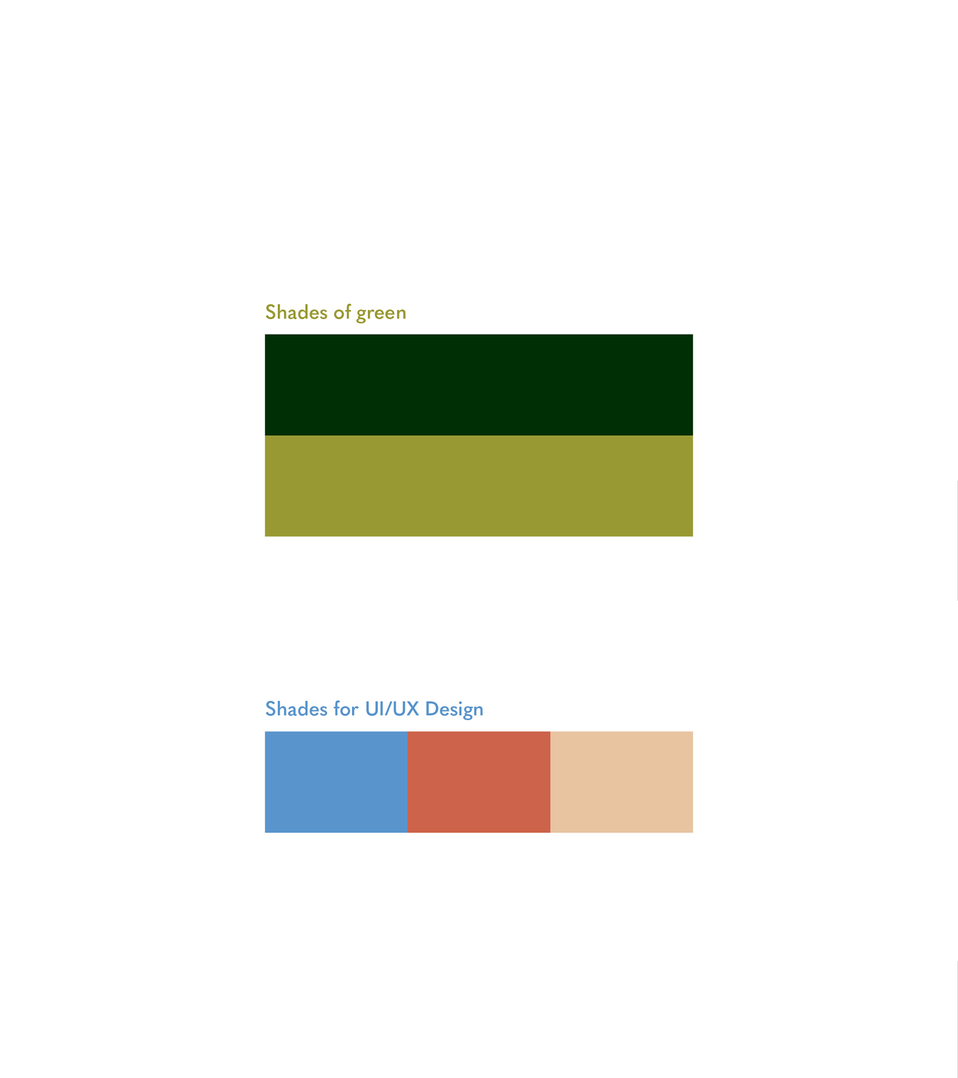
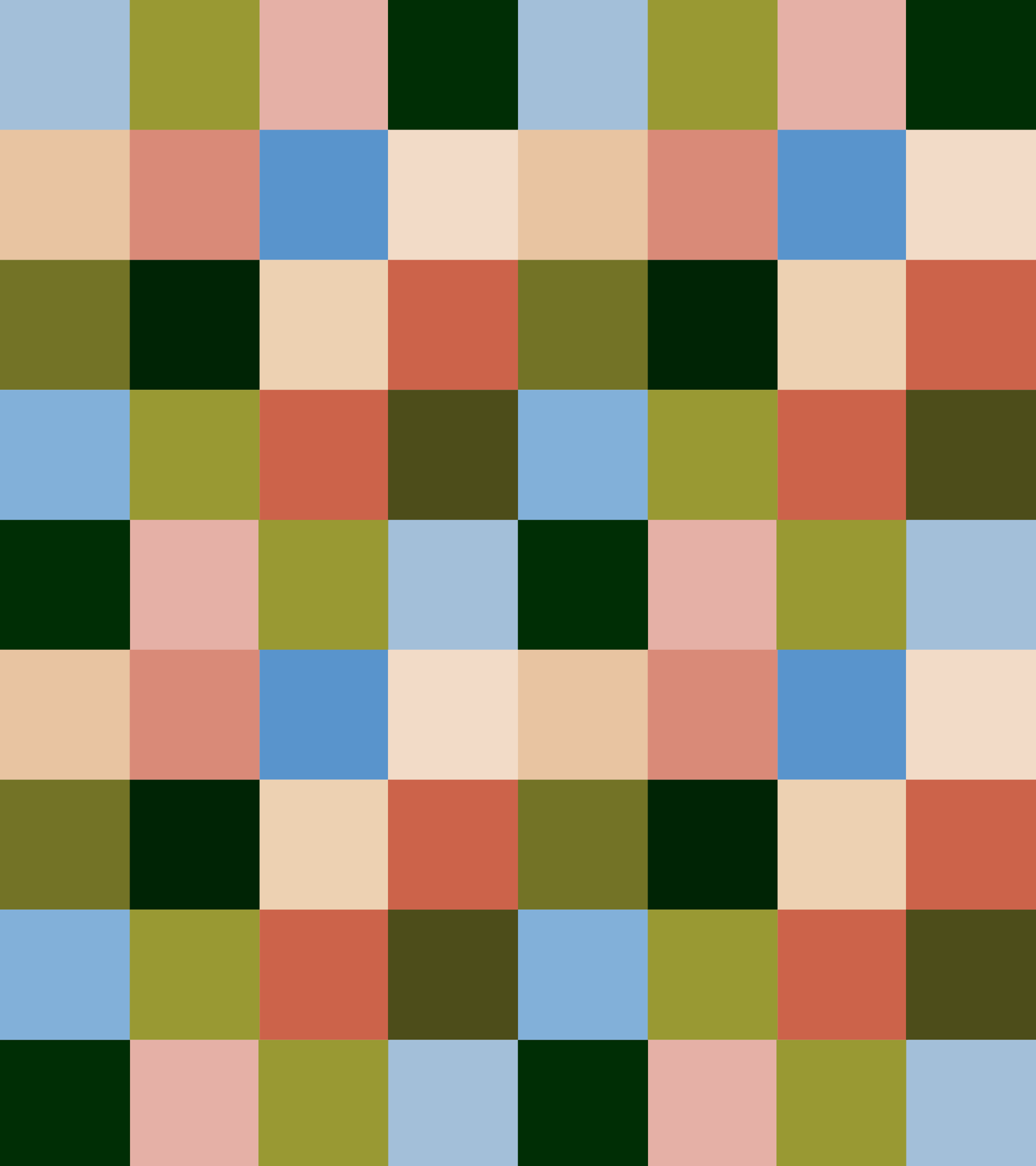
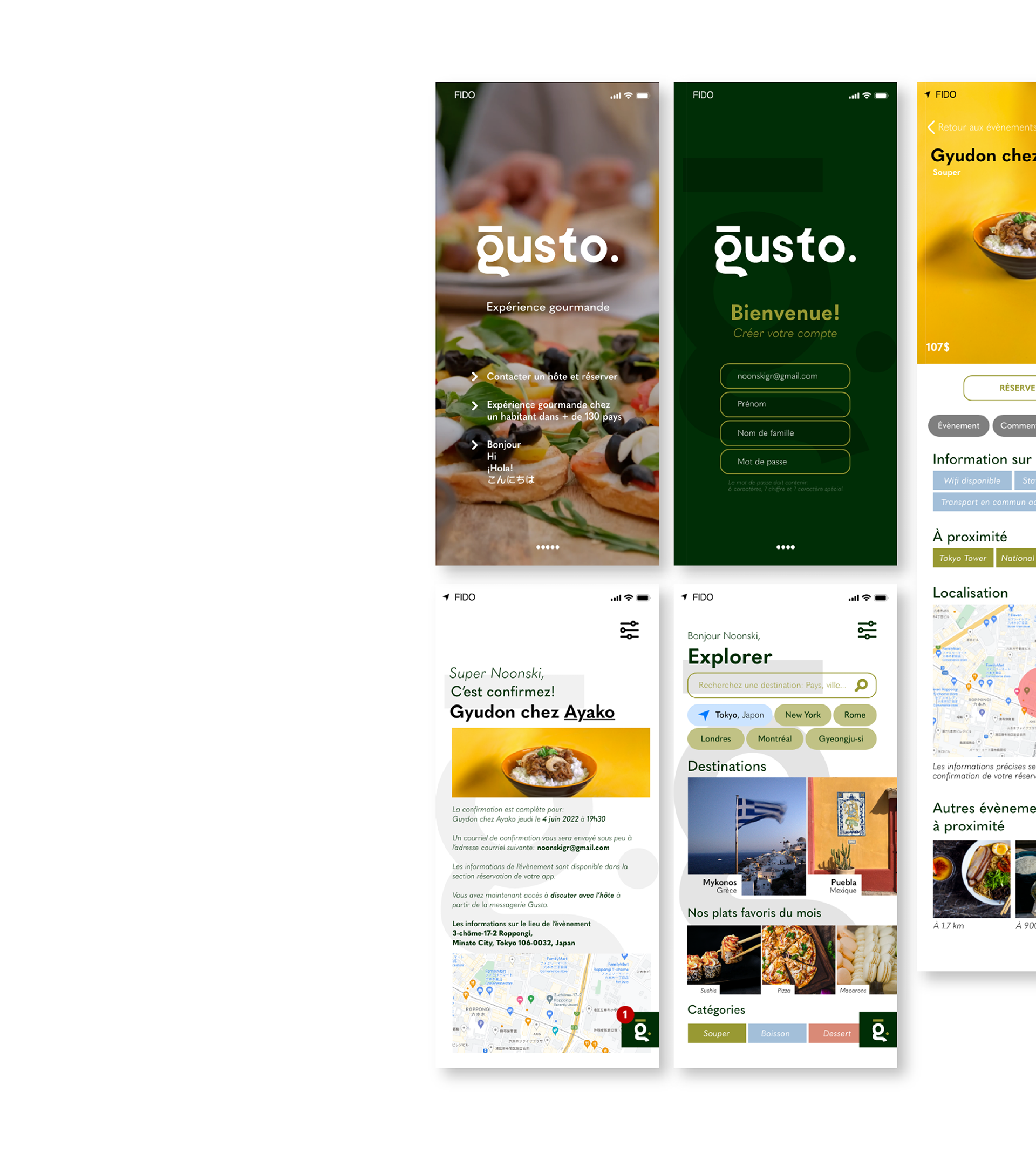
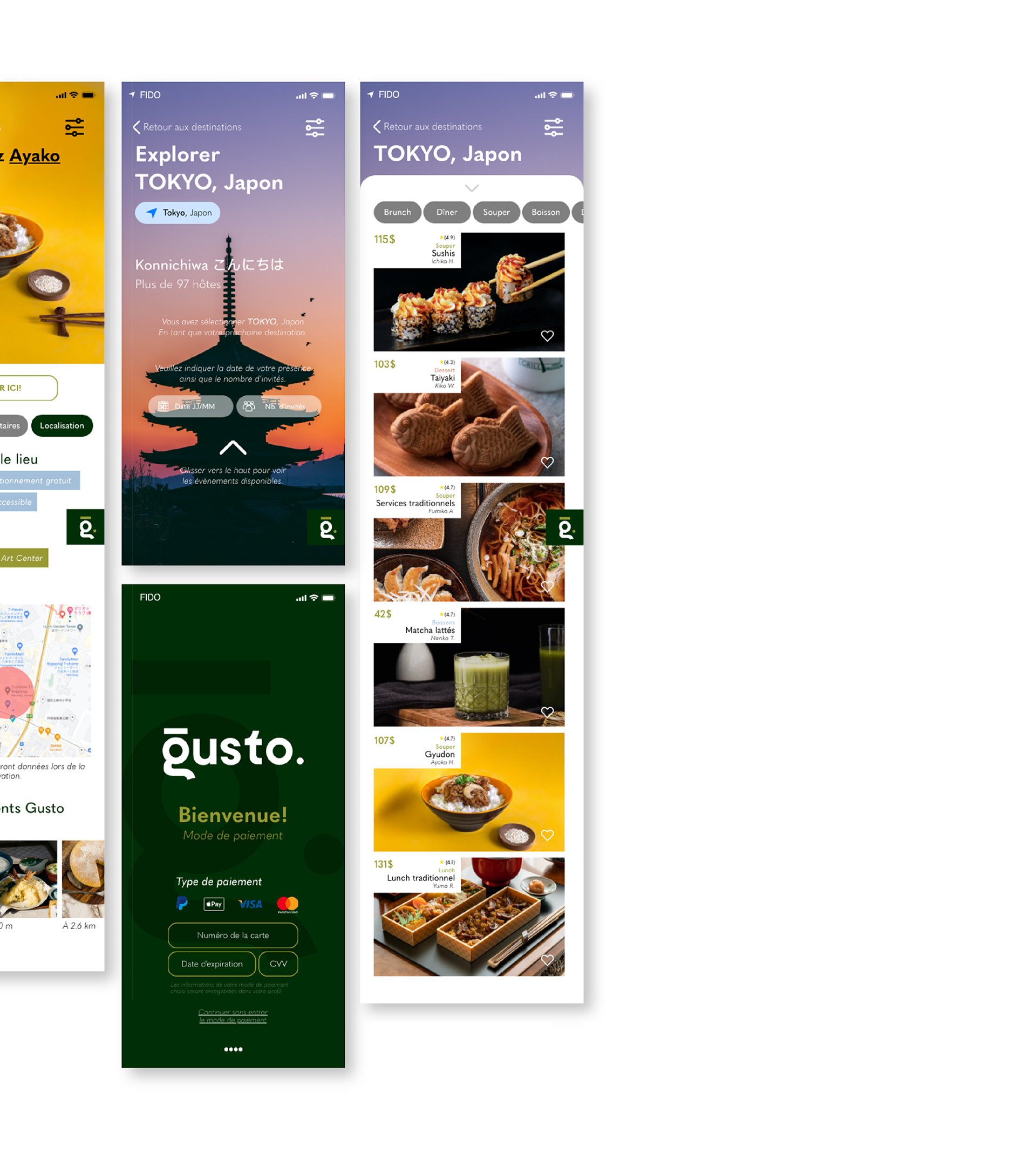
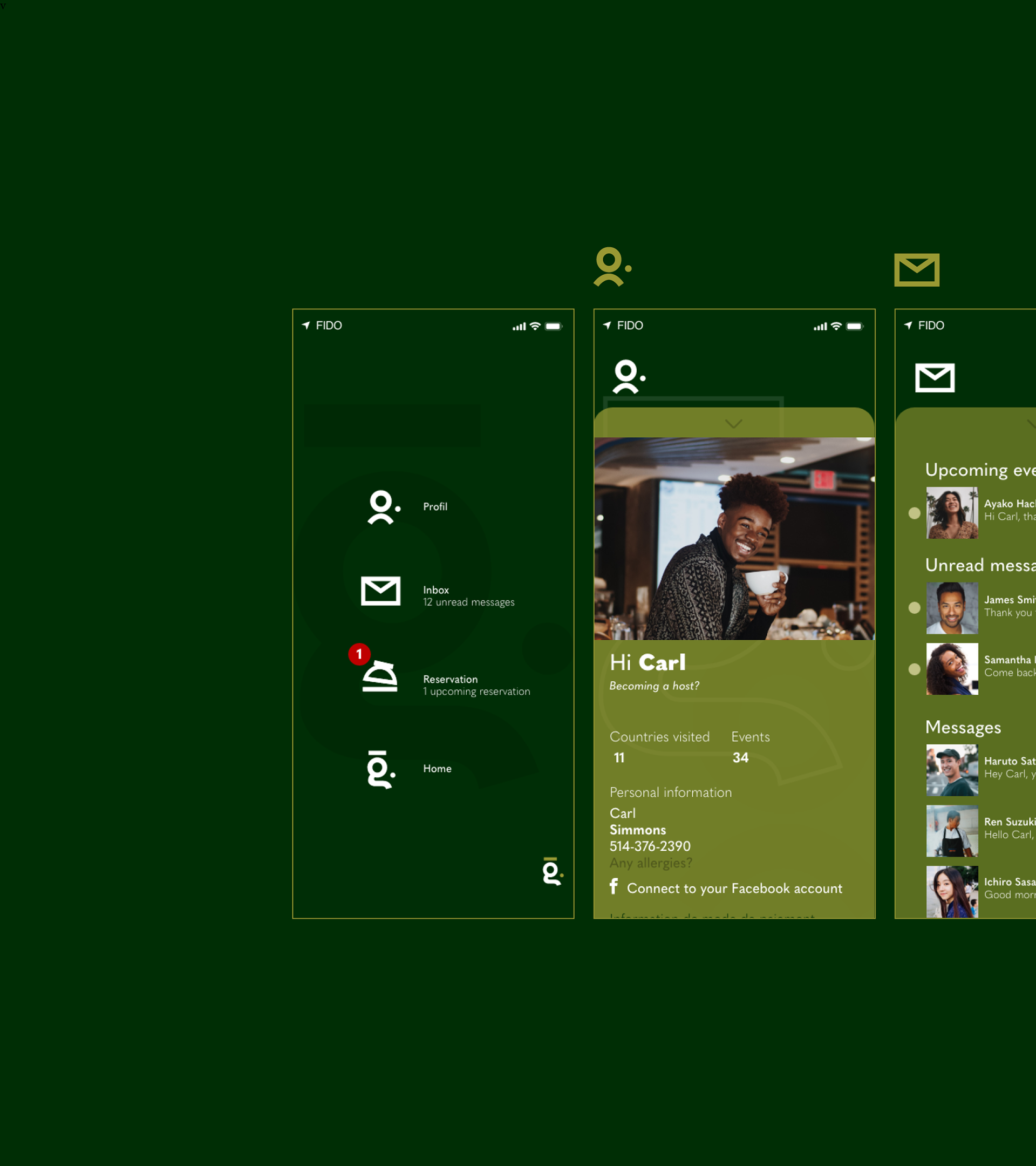
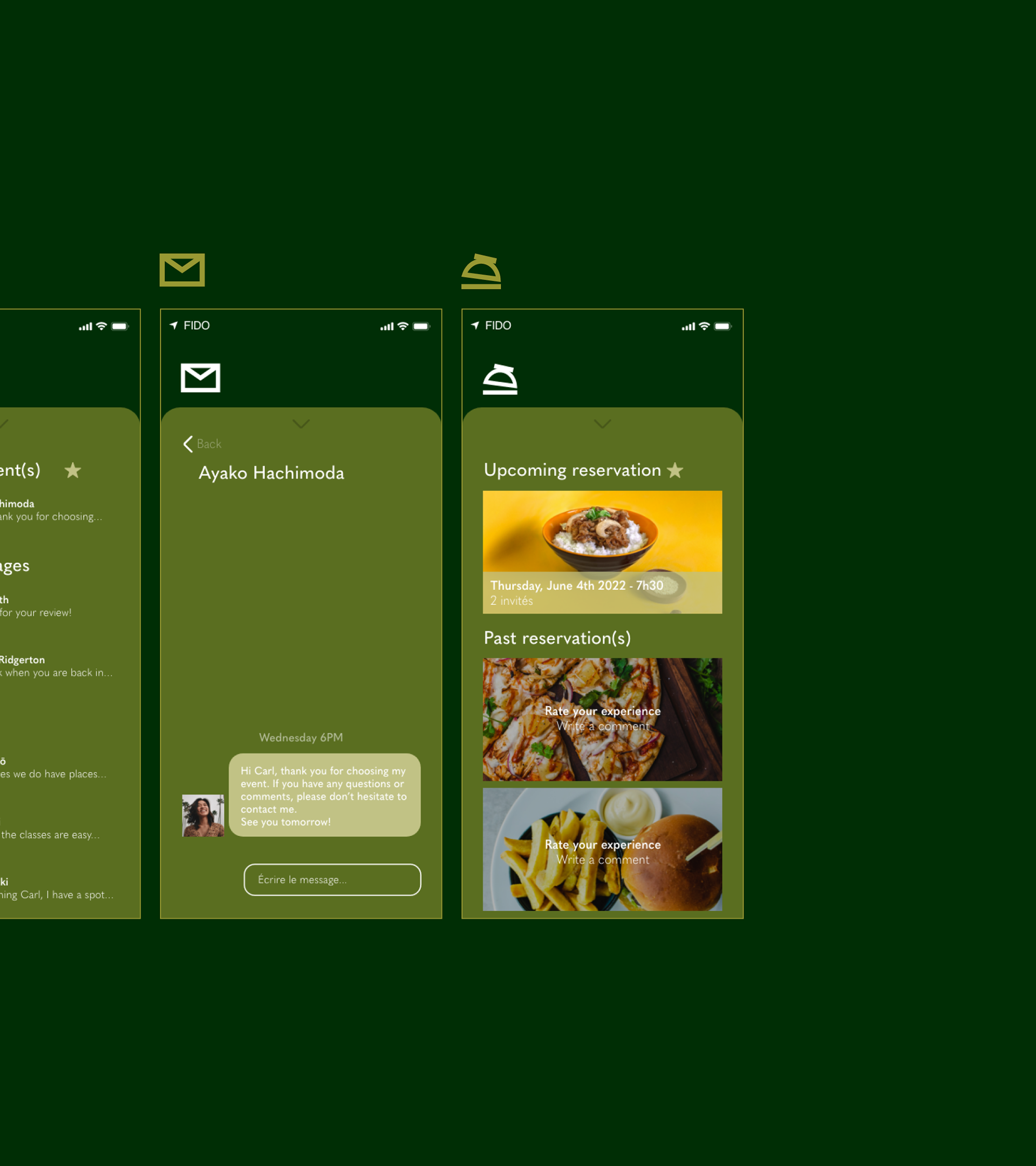
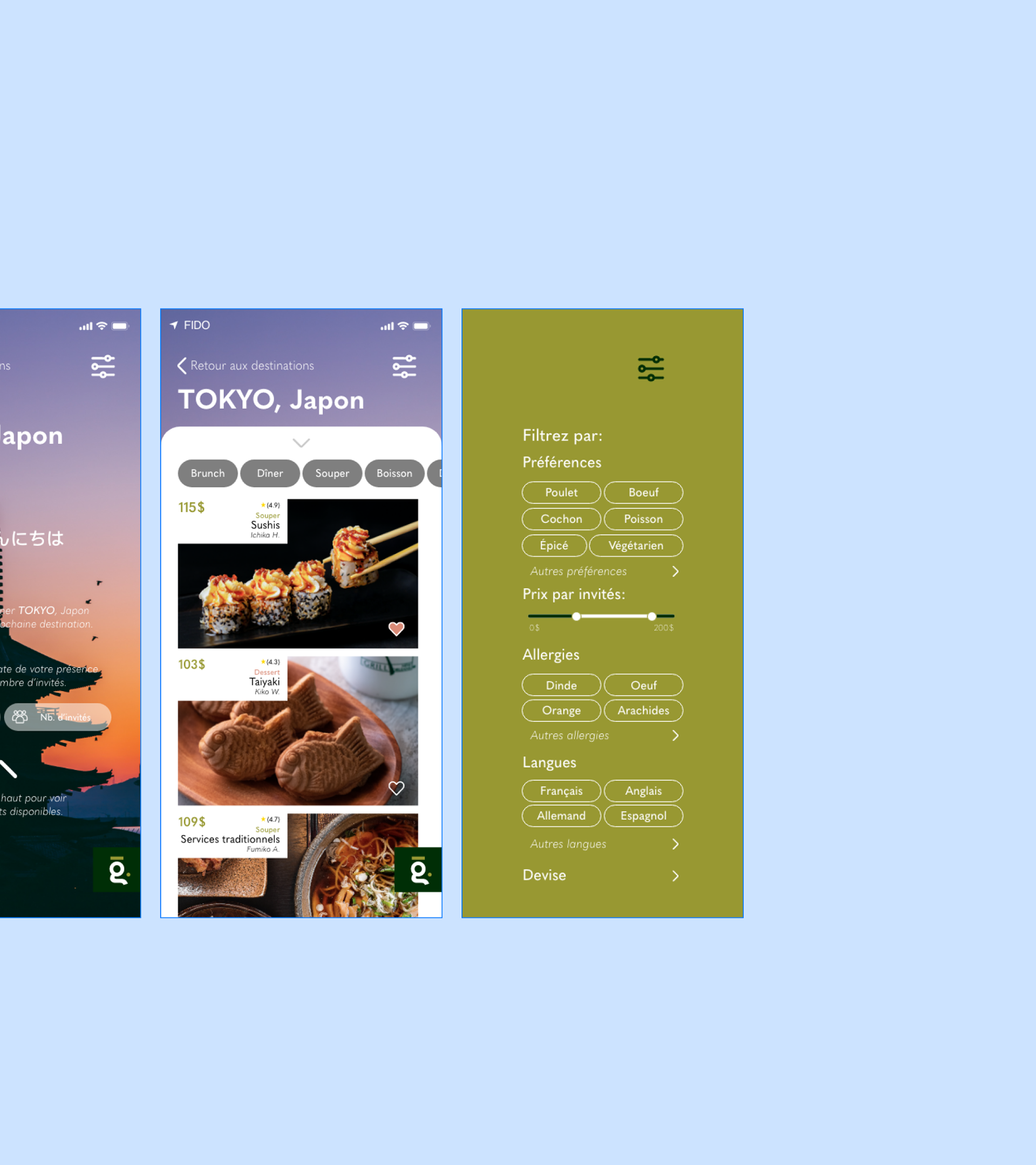
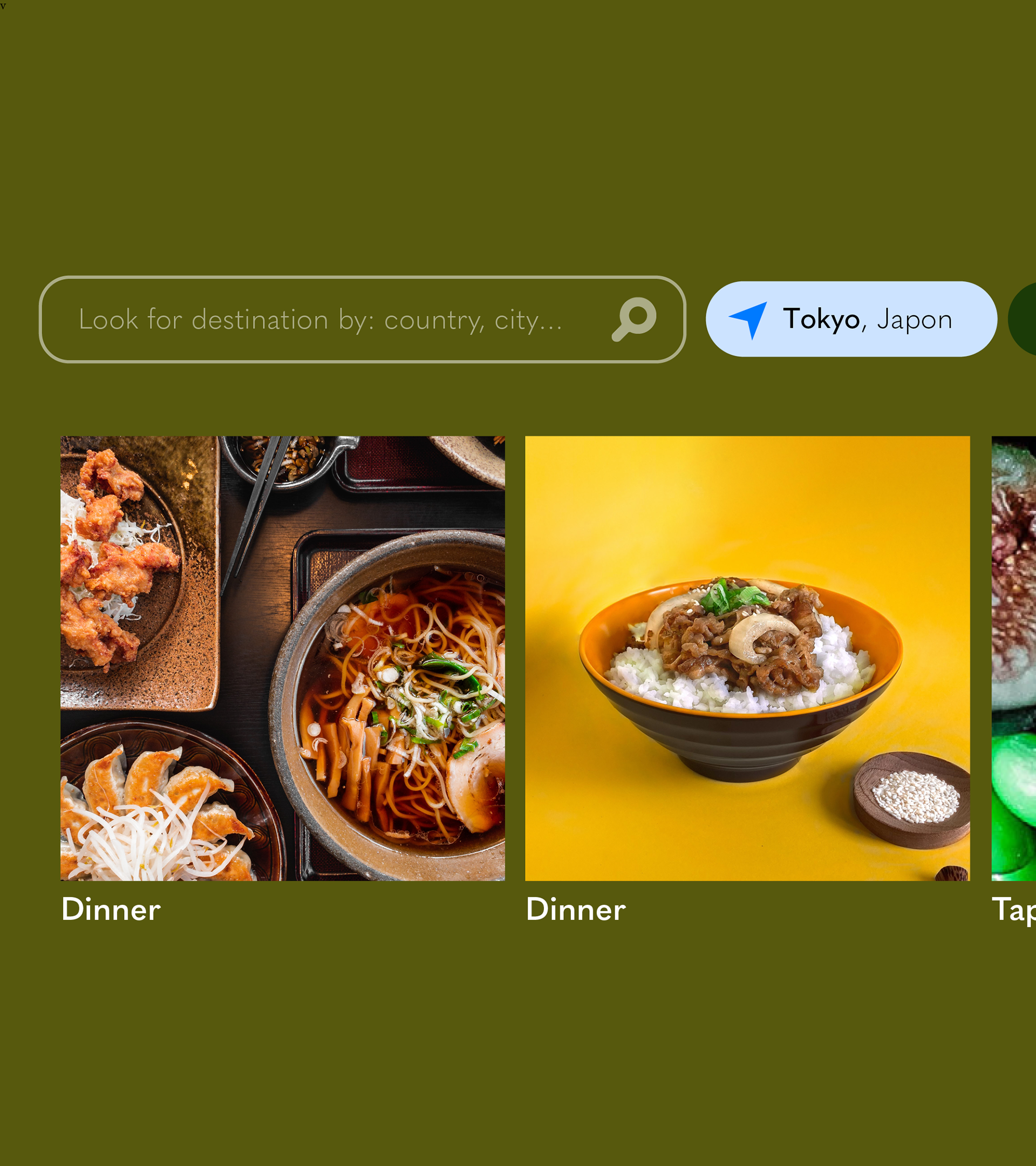
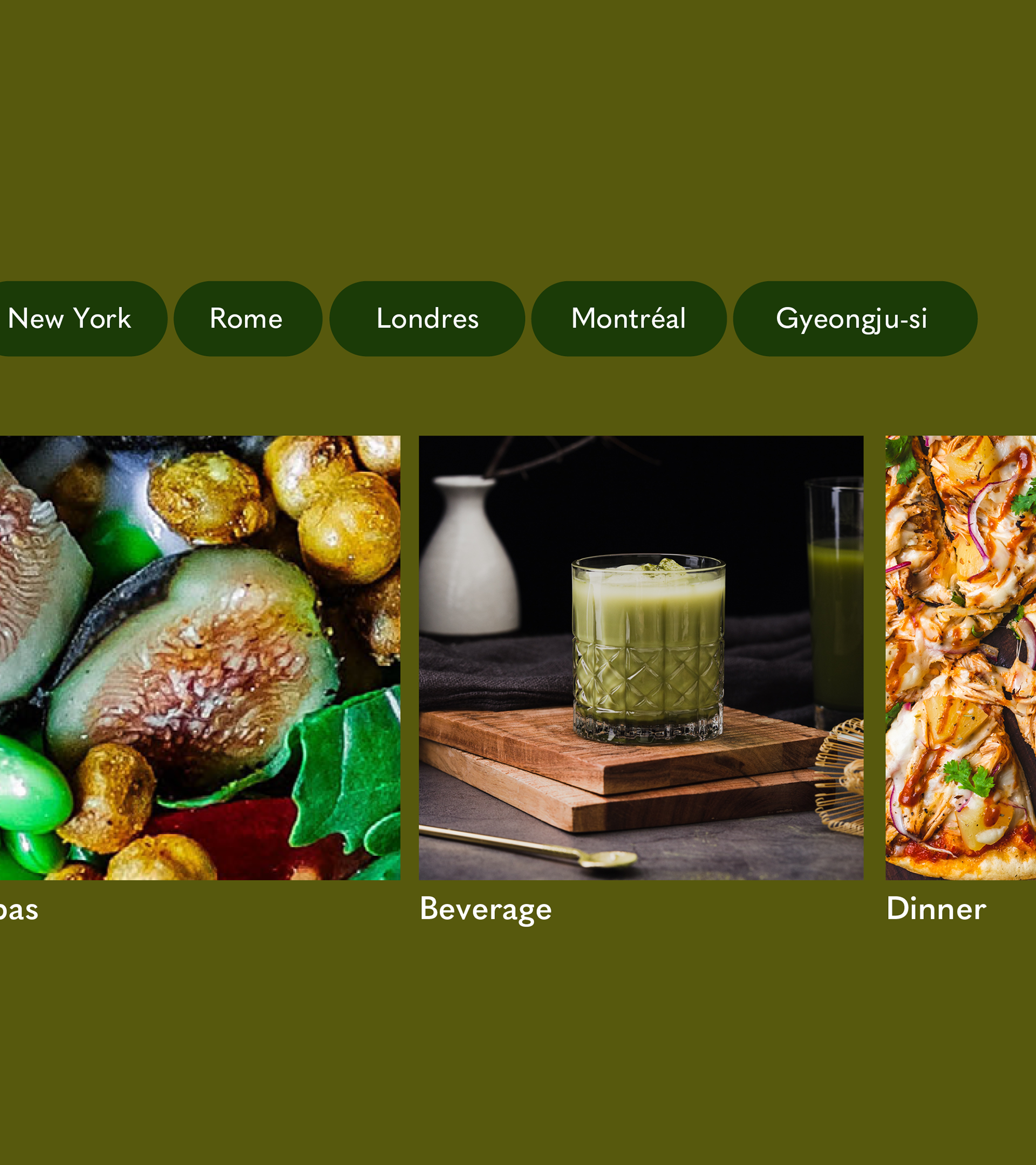
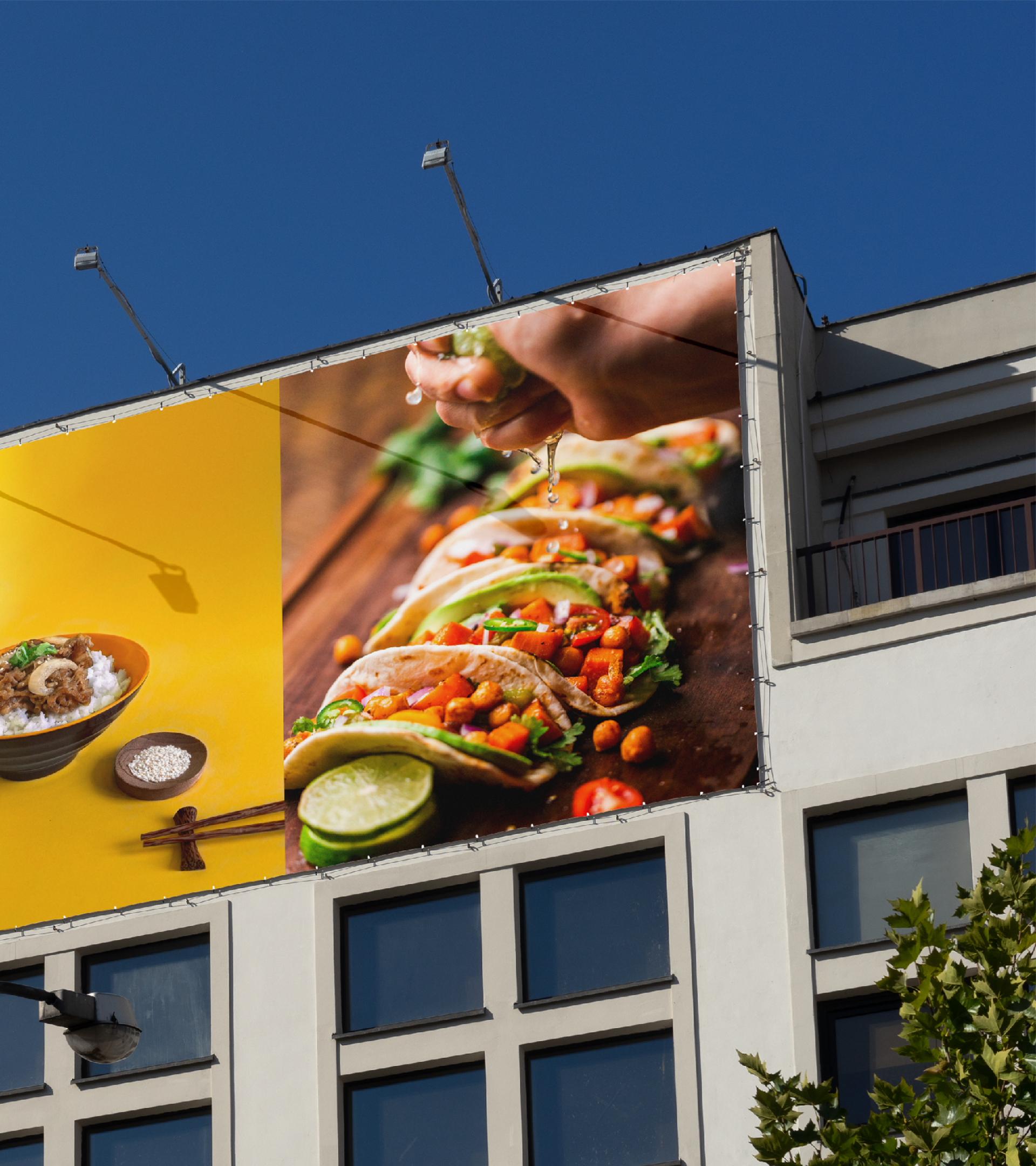
The graphic elements
for Gusto.
for Gusto.
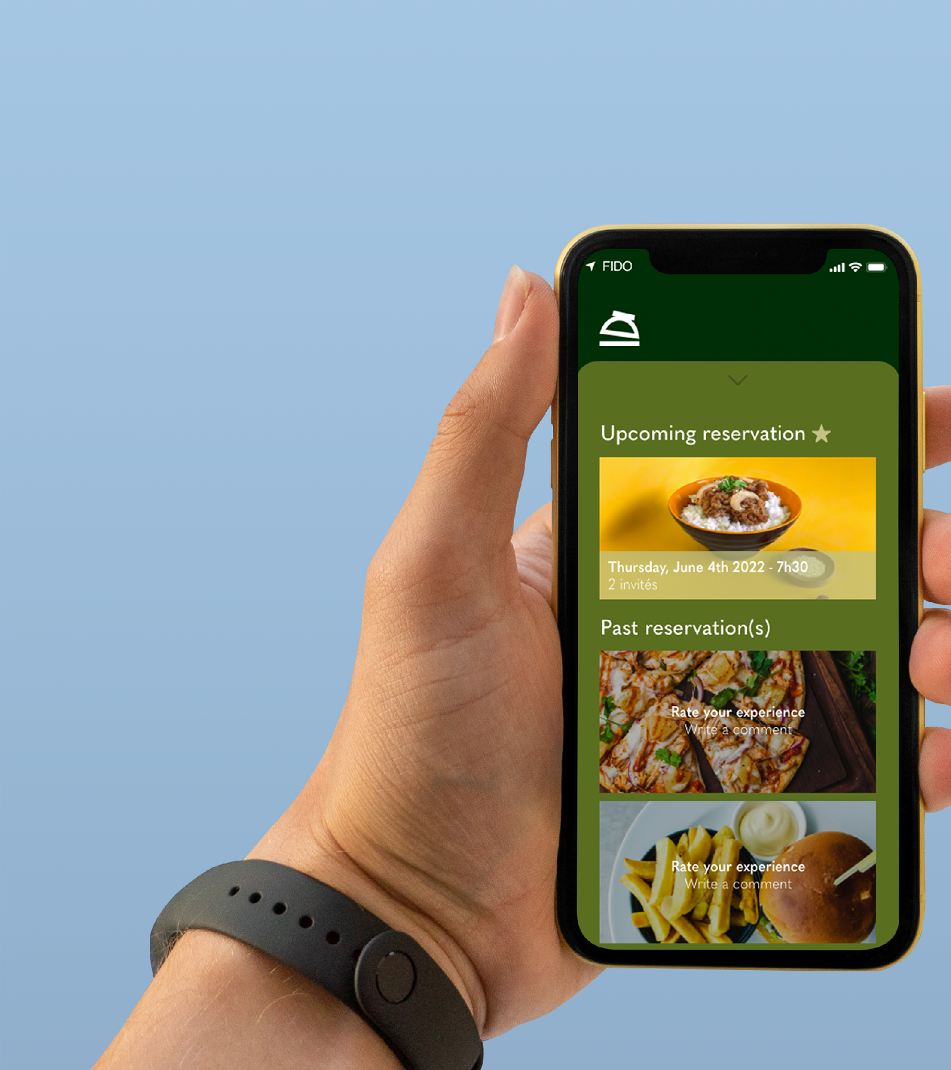
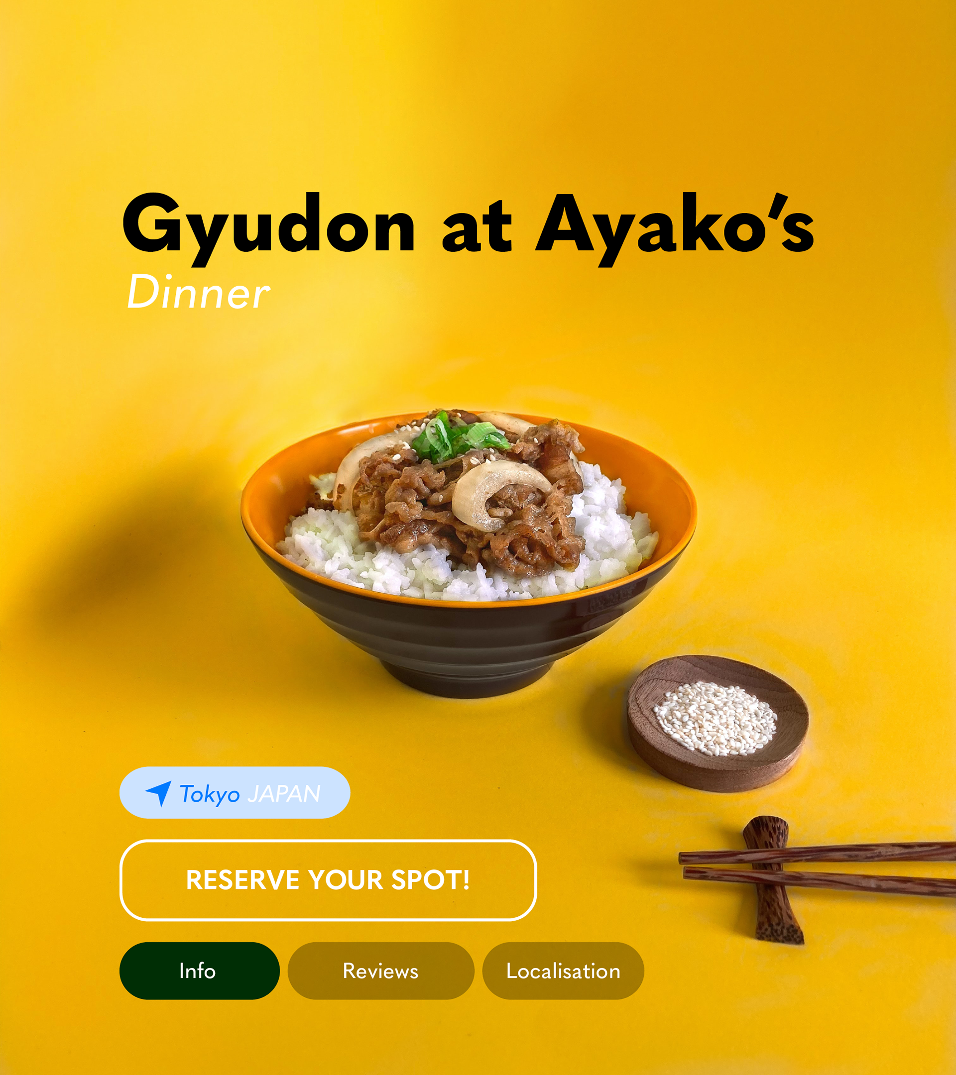
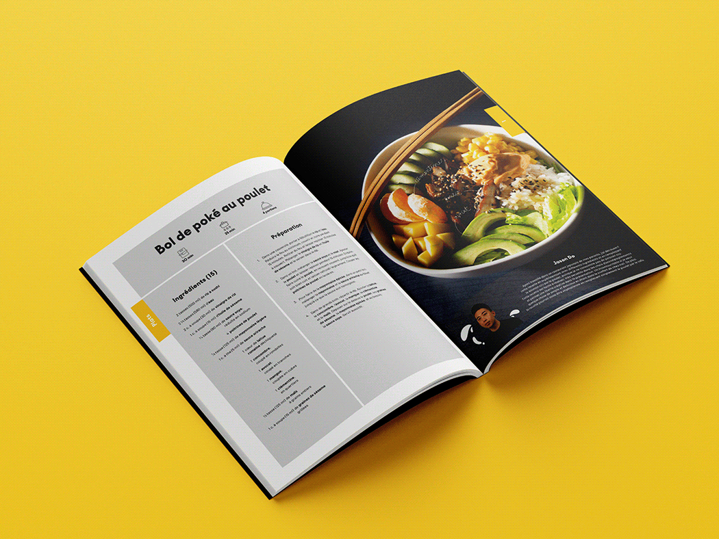
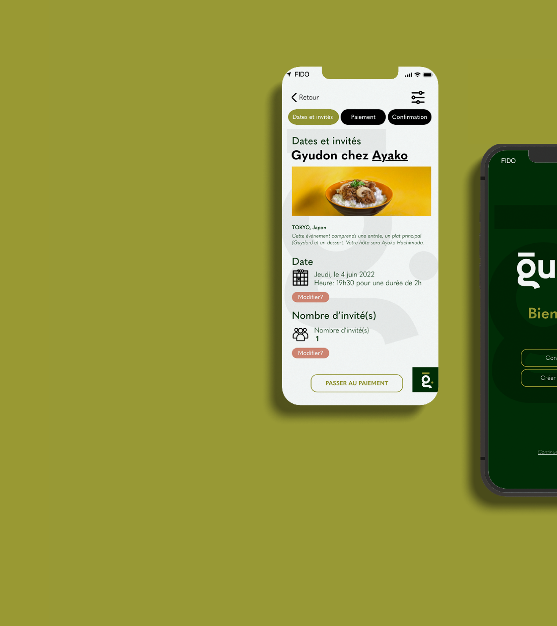
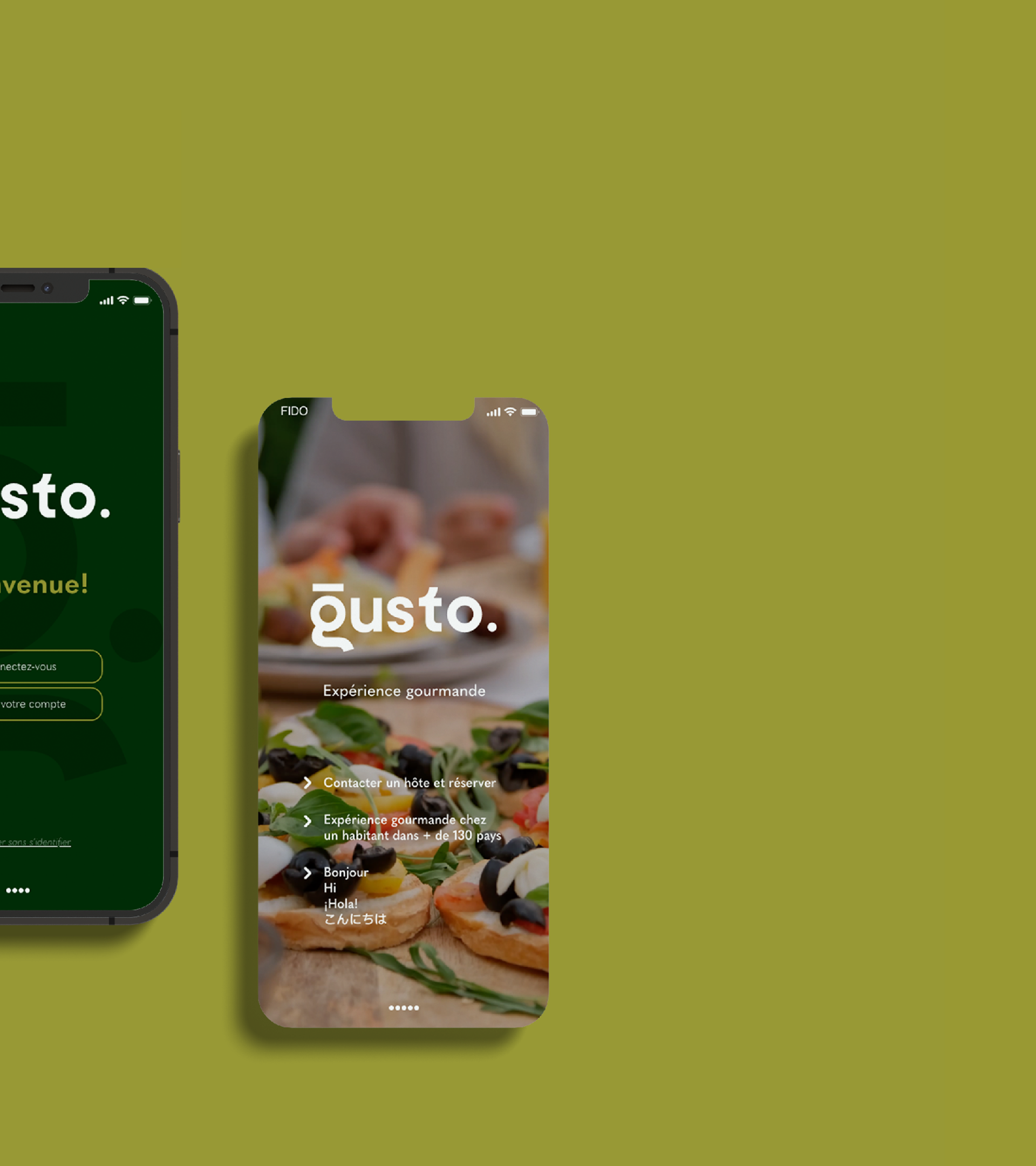
App information